07 Jun 2026

feedWordPress Planet

Gutenberg Times: Gutenberg Changelog #131 – Gutenberg Plugin Releases 23.1 – 23.3, Calls for Testing for 7.1 and more

In episode 131 of the Gutenberg Changelog, Birgit Pauli-Haack welcomes Isabel Brison to discuss the latest developments in Gutenberg plugin releases 23.1, 23.2, and 23.3, as well as progress leading up to WordPress 7.1. The hosts highlight recent calls for testing, including collaborative editing-previously delayed from 7.0 due to stability concerns-and the new media editor modal for the image block.

Isabel Brison shares insights into the new responsive global block styles, allowing users to customize styles per device breakpoint, as well as updates to the layout and dimensions controls in the block editor. She encourages feedback from users as these features iterate for the upcoming WordPress 7.1 release. The episode covers stabilizations, such as the improved, more ergonomic media editor and cropper, and strides in accessibility, particularly regarding the tabs block.

The hosts also discuss experiments in dashboard widgets, content type management, and empowering plugin developers with new admin UI components. Both stress the importance of community feedback and testing, given the ambitious new features arriving soon. The episode wraps with practical notes on documentation improvements, React 19 integration, and a reminder of the short summer break ahead.

Show Notes / Transcript

Show Notes

Special guest: Isabel Brison

Calls for Testing

What's released

Gutenberg releases

Stay in Touch

Transcript

Birgit Pauli-Haack: So welcome to our 131st episode of the Gutenberg Changelog. We will talk about Gutenberg plugin releases 23.1, 23.2 and 23.3. There are calls for testing out for WordPress 7.1 and we have more. I'm your host, Birgit Pauli-Haack, curator at the Gutenberg Times and a full-time core contributor for the WordPress open source project sponsored by Automattic. Today, Isabel Brison joins me from Sydney again. Isabel is a longtime core contributor and JavaScript developer on the Gutenberg Project. Welcome back to the show, Isabel. Thank you for joining me. How are you?

Isabel Brison: I'll be good. Thanks for having me. It's always a pleasure to be here.

Birgit Pauli-Haack: Well, I'm so glad you're here because you and your team have worked on some of the most exciting features that coming to Gutenberg. People have been waiting for quite a long time. So we will dive in when we get to the updates. How is Sydney?

Isabel Brison: It's winter, cold, rainy, you know, the usual.

Birgit Pauli-Haack: The usual? Yeah. How is the technology? I know you're going to meetups there. Are these WordPress meetups or are these other technology meetups?

Isabel Brison: I go to a variety of tech meetups. There's not a huge amount, so I'll go say to JavaScript meetup and there's a good technology leaders one too. I enjoy going to the Python meetup even though I don't work with Python. It's just a lovely community and they have some interesting talks. So it's sort of whatever's on offer, I guess.

Birgit Pauli-Haack: Oh, nice. Yeah, I found out in Munich to the technology community and I kind of connected with a local Claude meetup community and it was kind of interesting at the Technical university or the Design university, they switch around the places, but it was interesting. Yeah, they had some lightning talks. Yeah, like 20-minute talks and it was really cool. Yeah, I think we need to get out more.

Isabel Brison: Yeah, no, I like, I like going out after work and just, you know, even if it's just to listen to some tech talks, you get a bit of air and meet new people.

Birgit Pauli-Haack: Yeah, that's good. Yeah.

Announcements

All right, so we have a few announcements. WordPress 7.0 has been released two weeks ago and we are heading big steps towards 7.1. Beta 1 is scheduled for July 15th. That's kind of a little bit of ahh. It's only six weeks away.

Isabel Brison: Yeah. So we get going not long time at all.

Birgit Pauli-Haack: And contributors have been working on the next major version already. So the official roadmap planning post is in the works. The team is in the final steps to assemble the release squad and we do well from the Gutenberg plugin releases we get a pretty good idea what might come through also from what didn't make it into 7.0 as well. So we will. But it's the web, right? Web is translated for me in the Japanese kind of design thing. Yeah, it's like wabi sabi. Nothing is finished, nothing is last, and nothing is perfect. So we always get work to do and it's always getting better. Yeah.

Isabel Brison: Yep. It's a work in progress.

Birgit Pauli-Haack: It's a work in progress.

Calls for Testing - WordPress 7.1

So there are two calls for testing out now. One is announcing the collaborative editing outreach effort for 7.1. Many of you dear listeners remember, okay, collaborative editing, real time collaborative editing was pulled from the 7.0 because it wasn't stable enough for all the hosting environments that are out there. And there was this call for testing out for hosting and now there's another one for outreach effort to make sure that everything is kind of caught for 7.1.

And Anne McCarthy just published it on the Make Core blog so you can join it anytime. There's a separate channel Collaborative Editing Outreach that you can. It's kind of modeled after the full site editing outreach program that ran for two or three years. I hope this doesn't run for two or three years before it's released, but it definitely there are more people kind of discussing it and how it all supposed to work. Amy Kamala, who was the Release Coordinator for 7.0 and Justin Tadlock, who is a developer advocate at Automattic and Theme Team Rep are helping Anne to coordinate those calls for testing. And also some of the teams at Automattic who work with Enterprise level are also there. So yeah, it's a bigger discussion on how collaborative editing works on all the levels.

Isabel Brison: Yeah, it's a pretty big and complex piece of work.

Birgit Pauli-Haack: Yeah, join the channel and dive right in if that's a feature that you are excited about. I'm excited about it. But I also only have two or three people that handle my editing stuff. So I don't have 10 or 15 editors in my post zone.

Another call for testing is about the media editor Modal that has been added to the image block. Ramon Dodd published a call for testing about two weeks ago about the new modal for the image cropper. It's kind of the bigger image cropping in the block editor, so you don't have to. It's a much easier way to get your images in line, but you can also rotate the images and resize them. And it has been merged with the Gutenberg plugin. It also, with 23.3, is out of experimentation. So anybody who has the Gutenberg plugin installed can be testers. And Ramon has some great details on how to test things and what to look for and how to share the feedback. It also has a little paragraph there on what's out of scope. So for this version, we of course share all the links in the show. Notes. Isabel, you're part of that project. What excites you about it?

Isabel Brison: I haven't actually, actually worked on it. Well, not I, I, I helped a little, a little bit at the very beginning when we were discussing sort of choice of libraries and whether to build our own or use a third party. And a bit with the initial testing, but it was mostly Ramon and Andrew's work. This latter part, the bit that's now in Gutenberg, in fact, it was all their work. And I think it's super exciting because replacing the old, the old Cropper, I. I never liked it. I have to be perfectly honest.

Birgit Pauli-Haack: I hate the old Cropper.

Isabel Brison: I never could figure out how to use it. It was not ergonomic at all. And this one is such a better experience. Aside from allowing us to do all the stuff that the old Cropper, the in Editor Cropper is what I'm talking about. The one that you can access from the Image block toolbar. It's also on the site Logo block. So you can now access it from both those blocks and the new one, in addition to what the old one did, also allows you to do free cropping and free rotating. So if you want to rotate your image 3 degrees and if you want to crop it to whatever weird aspect ratio you like, you can do that, which you couldn't on the old one. Yeah, and it's. It's just a much nicer experience. I believe it's also more accessible than the old one in terms of the keyboard accessibility of it. It's. It's better too, so. All advantages. Yeah, they did a great job on it.

Birgit Pauli-Haack: I used it just for a little bit and I was so amazed how smooth it was. Yeah, I kind of. It was also much more intuitive. I never knew what to do with the Cropper when I was pinging it previously and said, so how do I do this now? Every. I had to think every time. And this one is very, very intuitive and very smooth also to use it and to see it. So I'm really happy about that. I'm hoping it makes it into 7.1. Yeah, so we have that.

Isabel Brison: Yeah, it's, it's on track, I don't think. I mean, barring any major natural disaster, I don't think that there's any reason for that not to make 7.1. It's a great piece of work. It's really stable and now that it's not behind the experiment flag anymore, real users are using it. I'm sure we're going to get tons of feedback if there's anything that's not 100% perfect and we still have time to iterate on it until beta one.

Birgit Pauli-Haack: I really appreciate that Roman and Andrew went to the research portion and kind of looked at how other graphic programs actually are doing things and tried to get some of the experiences also into the blocked. So okay, yeah, so two calls for testing for those who want to dive in. It's a very good way to contribute to WordPress because it's so close to what you're doing with WordPress. And not only developers but also content creators can help testers even better and those who work at agencies or work with clients at agencies to kind of see how that all works. Which brings us to what's released. I mentioned it.

What's Released - WordPress 7.0

WordPress 7.0 Armstrong was released. We talked about it in previous episodes on this changelog with various people from the agency view, from the designer view, from the content creators views. We will share in the show notes in case you need to catch up. The Field Guide the link to the official field guide for WordPress 7.0 as well as to the source of truth on Gutenberg Times that has all the user facing stuff in there. Those are the best information on 7.0. I have not seen in the last two weeks any major boo boos that came in. Yeah, it was such a great testing cycle with a delay of six weeks.

Most of the bugs were actually caught quite early or in the loliso, I don't think. I'm not sure when there will be a point release which normally happens within a few weeks of the major release, but I have not seen any planning for that. But it could be end of June after WorldCap Europe.

So let's dive into the Gutenberg releases. We start with Gutenberg 23.1. Oh, one question, Isabel, do you have a favorite feature that came into WordPress 7.0?

Isabel Brison: Oh, I don't know. There's a bunch of interesting features and I worked on some of them. Of course I have sort of my personal favorites of the ones that I worked on of which one that is. It was very, very subtle or sort of low profile. We didn't talk about it much, but I worked on a little handy addition to the grid block or the grid layout type, I should say. That allows us to configure a responsive number of columns. So by setting column count and a minimum width you can say I want my block to always have at maximum three columns but on smaller screens it can go down to two and even one. So that's something we didn't have before and I'm quite happy with it. I think it's a good improvement. But compared to. Oh, there was. There was loads of stuff. The pattern editing work I think is going to be really handy. And what else? There was the notes feature.

Birgit Pauli-Haack: No, I was in 6.9 already. Yeah.

Isabel Brison: Oh yeah. No, there was something about what? Oh God, I'm confusing my releases.

Birgit Pauli-Haack: Yeah, yeah, they're kind of. They melt together once it's released. They melt all together. It's kind of. Yeah. Was it there or there? Yeah, sometimes.

Gutenberg 23.1

All right, let's dive into Gutenberg 23.1. It was released on May 7, had 212 closed PRs by 49 contributors. So we are really wrapping up the releases or the work on Gutenberg and the block editor. It's now not only the block editor, it's also the site editor. It's the data views, it's the. The design system, those all. So the Gutenberg repo has kind of exploded in other areas for the WordPress ecosystem. So. But yeah, the first one on the list and it's. It's really interesting how these change logs are actually automated and coming together is the upload media and it enabling concurrent sideload uploads. That's an interesting thing because it's so performance issue to have multiple streams on upload on images so you don't have to wait so long that the image shows up in your block canvas. And that's a really good improvement for that.

Isabel Brison: Yeah, yeah. I'd imagine when uploading, when bulk uploading particularly.

Birgit Pauli-Haack: So when you copy paste content from another source it has this also a feature that you can download and upload the images that you connect there. And that also happens in this module stream uploads thing. So it's really cool. You only know this because it's faster but other than that there's no disruption of your work or any of that.

Isabel Brison: Yeah, there's a lot of good work. This was also the client side. This is part, I believe, of the client side media processing work that did not make 7.0 but is now being aimed at 7.1. That's mostly Adam Silverstein's been working on that. I haven't kept a close eye on it, but it looks like, you know, very useful work and it'll be good once we manage to get it in for performance.

Birgit Pauli-Haack: Yeah, Adam Silverstein has worked on these image handling features quite a bit for 6.9 as well.

Enhancements

So yeah, there is an enhancement that I have flagged here, but I'm not sure how useful that is. It's for the WordPress UI overlays and a global preview styles on the storybook. So the WordPress UI is the next level of components for WordPress.

Isabel Brison: It's sort of the successor of the components package.

Birgit Pauli-Haack: Yeah. And at the moment both are used, but I have seen now efforts to migrate, merge things, I don't know how you call it, but to get it kind of in one thing. But the overlays, the preview styles is how you can show the preview in the storybook so you have a better inkling how it's going to look later on.

Isabel Brison: Yeah, that should be good.

Birgit Pauli-Haack: And then there are tons of changes for the components, the admin ui, the UI components, dialogues. This is mostly for developers that are working with WordPress and creating their own either building WordPress or creating plugins for WordPress to have a unified design system, unified component system that they don't have to kind of come up with their own interfaces. Those decisions are already made and you can kind of build on top of things before any of that, even the components, every plugin had to design their own interfaces and now this is really cool.

Isabel Brison: Yeah, it's good to have a sort of a system that you can use when you're extending and you need to build a new screen or something for your plugin, you can just use these components and everything looks integrated with WordPress.

Birgit Pauli-Haack: And it's also good for the users because they don't have to think about how do I use this tool now? Or how, how is. How do I filter now on this screen? Because it's all a unified system and it's all built out and stable. So the next thing is on the notes getting a few updates. So right now it's in 23.1. It's mostly refactors on the positions and the floating board. But we will see later in, in the other releases that there are some nice features coming in for the Blocked libraries. We have updates to the tabs block. I'm really hoping that it comes into 7.1. It's still behind an experiment flag, but now it can handle duplicate tabs, meaning duplicate handles on the tabs. And it follows now WCAG tabs pattern for accessibility in the renaming of the blocks. So which is a. It's a major step towards accessibility and acceptance for that. I'm really waiting for the tabs to come into Gutenberg or to.

Isabel Brison: Mostly I think the renaming was about as I understand it, so that the blocks have names that match the accessibility standards or how these things are known as. There's a WCAG pattern it's linked to in the PR, and those sort of example patterns that the WCAG website has for people to know how to use ARIA attributes correctly, which is a whole science. And the idea is to have our tabs blocks match the names of that pattern so that it feels more standard and it'll be more familiar to people who might have implemented tabs in other places.

Birgit Pauli-Haack: Yeah. And those are the standards also where screen readers kind of tap into and people are. That use screen readers kind of have a common pattern for that. Yes. So that definitely elevates the tabs block in its accessibility. Yeah.

Isabel Brison: So it's going to be pretty useful block once it's stabilized. So I hope it is.

Birgit Pauli-Haack: Yeah. Yeah. I know that quite a few block collections have tabs right from the beginning in the last eight years. And they're not going to go away because the first iteration of any of the core blocks will not be as feature rich as any of the block collections that have been developed for the last six or seven years. Yeah. The next one is tapping into the image cropper we talked about. So you can. And it was tapping into the keyboard actions with drag handles on the canvas. So you can use your mouse to do some of the actions that you want to do with the image cropper or the image tool. Yeah, if you say Image Cropper, it kind of reduces it to cropping, but yeah, it's also the handling to rotate

Isabel Brison: And all that too.

Birgit Pauli-Haack: Yeah, yeah. There's a new API for the WordPress grid package, but that's a different grid that you are working on.

Isabel Brison: Yeah, that's not the layout. The block layout grid. This is something else. This is a grid that you can use for dashboard UI.

Birgit Pauli-Haack: Exactly.

Isabel Brison: Sort of admin stuff.

Birgit Pauli-Haack: Yeah. That's the new API that powers the new experiments that in Gutenberg. That is the dashboard widgets. We kind of talked about it a little later. You as a plugin developer or extender of WordPress, you can use them now as well for any of your dashboards. If you are having a plugin that has some data vising kind of, you can put them into these grid package and display them on your plugin settings pages. The guidelines is also a new API and it has now a public API method and the REST API route to it. There have been iterations after 23.1, so I think that that would be really helpful to look at later.

New APIs

The guidelines are actually a whole set of content types that are for AIs. Pretty much when your agents come to the WordPress site, you can tell them what to do with things. What's the purpose of the site? The editing guidelines? Yeah, how, how you want AIs to behave on your site if you let them in. And it's really important when you have other agents come in that you don't control. Yeah, that sounds scary.

But if you as a site owner connect your Claude to your website, you can have in the guidelines all the things that you want Claude to know about your site. So it's. You don't have to put it all in a prompt and it kind of finds all the things and it's also your memory. So if you use an agent to do your SEO, to do your. Some of the content updates like headlines or tags, your policies on how to do tags and categories, that's all things that you can solidify in your documentation in the guidelines for your AI. And it will remember that. But it's also interesting to see the discussions about it. I had a short discussion with Grzegorz, who was a former co-host here on the Changelog, a few, I would say a few hundred episodes before, but it wasn't that much. But he is now part of that team who thinks about AI and memory and all that. And it was really interesting to hear because if you are in an agency, you work on multiple different sites, but you have one Claude, so you don't want things to bleed over from one site to the next. And these guidelines help you kind of keep track of everything. So it's an interesting problem space that came out with AI.

Isabel Brison: It's like providing the correct context and the correct amount of context so that the AI can be maximally productive on your website, whatever you want to do with it.

Birgit Pauli-Haack: Yeah, right. Yeah, yeah. Most people are really not all that into. Site owners are not so into AI, but it helps a few things quite nicely. I find it with SEO and with yeah, accessibility and all that. It's really helpful to have a double check there. Yeah. All right, what's next in 23.1? Do we have something?

Experiments

Oh yeah, there's these custom taxonomies experiment in 23.1 with the custom post types and taxonomy management that started out as out of. I don't know how that came about, but it probably is one of the radical speed month project as well that people say okay, we probably need to have content management when the APIs were in WordPress in 3.1. But there is no interface there and there were always plugins there to do this, be it custom UI, custom post UI or ACF or so. But there's no interface for. And that's where this experiment comes in to kind of push the envelope on that a bit. Have the REST controllers in there, have the interface in there. But it definitely is not the last word spoken there yet because that is a field where there have been a lot of extensions in the universe or in the WordPress ecosystem that might not fit in where this is going. So it's just a. It's a prototype kind of experimental way to do that. But check it out. You just have to enable the experiment in the Gutenberg plugin and then you can kind of try it out and work with it. It uses the common APIs.

The other experiment is the dashboard. We talked a little bit about it because that's the grid package was created for that. The dashboard to have administ page routes and sidebar menus as a shell to add additional grids on the dashboard. I'm interested to see. I haven't played with it yet but I want to see if I can. So what are the dashboards? The dashboard right now is just a. The quick edit and the site health and the news that's on your dashboard right now and a few other things and plugin kind of tap into that as well. But I have never have not seen yet and I'm still thinking about it to. Maybe Claude can help me with that. Having a quick edit that's a block editor actually. So when you log in into your WordPress site you don't want to kind of just do all the other admin stuff. You just want to create a new post. So why not have it on the dashboard and create a blog post right there from the quick edit. Quick Edit only gives you text based things but not block editor.

Isabel Brison: So a block based quick edit, do you reckon all the blocks. I reckon it would need to be A very simplified version of the block editor.

Birgit Pauli-Haack: Yeah. Yeah.

Isabel Brison: Maybe images, paragraphs, but yeah, that would be cool.

Birgit Pauli-Haack: Yeah, yeah. Lists. Yeah. Like an outliner kind of. Yeah. Very fast kind of. Yeah. Maybe come back to the white space, but kind of instead of having a classic editor, just build blocks with it. Yeah. So kind of a distraction free, quick edit, full set, toolbar on top kind of thing. I don't know. When I'm bored, I'm gonna star B. Prototype it. Prototype it. Yeah. And get it in. Yeah. That. That was one of the things that a lot of writers said. I don't want to deal with all the stuff I'm getting so distracted. Yeah. There's announcements and all that. So let me just start my blog post. But anyway, and then there is a list of Media editor modal call for testing. We talked about it. There's a whole in 23.1. There's a whole list of bigger and smaller PRs that went in. I think the call for testing gives you all the ins and outs of it that I think was. Was it. Did you find anything for 23.1 that you wanted to talk about further?

Isabel Brison: Not. Not really. Apart from the things that you've already highlighted. I just thought. I already mentioned that the media editor is also on the site logo block. So you can test it on both blocks and that's it.

Gutenberg 23.2

Birgit Pauli-Haack: So right into Gutenberg. 23.2 was released on May 21st and also with 204 PRs by 50 contributors and there were four first timers there. Congratulations. You got your first contribution to WordPress core. Yeah. And you got your badge. Well, you got your badge when 7.1 is released, I guess the first feature that is listed is the responsive global block styles with states. This is so cool. Yeah. What does it say? Can you walk us through it?

Isabel Brison: Yeah. So this was the first part of the work towards enabling responsive styles for blocks. And it's with States because it leverages a style states API that was already built. So Maggie Cabrera was who did that initial work for the States API, and her part was just leveraging it for adding the ability to style pseudo states for very few blocks have pseudo states. Well, this might be extended, but it won't be super extended because not all blocks need to have pseudo by pseudo states, I mean hover focus and things like that. So usually only interactive blocks would need those.

And so States came about to cater to that pseudo element scenario. But it was always something that could potentially be extended further. And one of the use cases that had been thought out when this initial idea of having the states API was thought it was using it to be able to create responsive styles for blocks was one of the possibilities there. And I had been eyeballing all those issues that have been sitting in the Gutenberg repo for years about creating some mechanism that allows us to define responsive styles. And I finally had the opportunity to pick them up. And having that state's work already partially done was great because, you know, sometimes it's starting something is the hard part. And there were endless decisions in the repo about how should we build this and let's do this and let's do that and let's not do that. And it's like we should take this into account. You know, how you can talk and talk and talk and then it never actually starts because it seems like the problem is too big and too complicated. And the more that's added to the discussion, the bigger and the more complicated it gets.

But there was this little stepping stone. This states API had already been built. And so I thought, well, it's already in there for pseudo states, let's try building responsive. So we call them viewport states. I've been working on this with my teammate Dan Richards. We've both started working on this and thought, okay, let's do as sort of a baseline for global styles, but then as a stretch goal, let's try and do it for actual block instance too. So we managed to do both in the end, but for 23.2, it was only the global block styles that was ready. And this means when you go into the site editor and into the style section, where you have global styles, then you go into blocks. This only works for blocks. It doesn't work for top level global styles yet. We're not quite sure. Well, we're not quite sure if there's a need to add this to top level stars yet. It's still something that's being thought about because for a lot of them, so a lot of really sort of global basic elements like typography, you know, font sizes. Okay, we already have ways of defining them responsively even without using breakpoints. So we are using the clamp function. You can define a maximum and a minimum and you can pretty much, you know, manipulate it so that you get your different font sizes on mobile and tablet and desktop. So there is to some extent you already have that responsive functionality there. So that's something that might be looked at later on for enabling actual breakpoints for those global styles. But for now it only applies to blocks so for each block you can go into the block, into the block's global styles and you can pick a state. There's a new little states drop down at the top and so by default you'll be styling the default state that's you know, no media query. And then you have a tablet and a mobile state and the tablet state is only, so it's, it's only from you know, the top level. Like what's your maximum Breakpoint to the minimum, which is the maximum for mobile. So the tablet styles will only apply to tablet to that breakpoint and then the mobile styles will only apply to their own breakpoint. And that's. Yeah, essentially that's it.

You can do anything color typography and spacing wise. So for most blocks you know, you have the typography, you have the colors, you have dimensions like not for most blocks you don't have dimensions, you have, you know, margin, padding, block gap if the block has layout and you can define per break point what you want those values to be. And there are certain features that exist in global styles that do not yet work with, with that responsive logic and those. So when you enter that breakpoint you know, you get, you choose the tablet viewport and you'll see that some of the tools might be hidden. So for instance, Duotone is one. You can't set Duotone per breakpoint yet. This is something that will be worked on in the future but it feels like a bit like I'm not sure how many people will need to change the colors per break point. That's not usually responsive styles are more about spacing dimensions, that sort of thing. So we focused more on those that felt like these are the ones that are really going to be used by most people and the more edge Casey ones if they don't work out of the box, we sort of. Okay that, you know, that's a problem for later. We'll, we'll figure it out later. And Duotone is one of those awesome.

Birgit Pauli-Haack: Yeah. Well a lot of people have been waiting for that a long time. So glad you, you finally started taking it.

Isabel Brison: I hope it's useful. I just hope that folks can take this and like ok, okay, I can finally build the thing and yeah, and it works. And please, please, to anyone listening and wanting to try this out, if there's anything that's not working, if there's anything you don't like or you think, no, no, this should be different because it doesn't work. Just please give us feedback. We need feedback because this is in the plugin now it's aimed to go into 7.1. We still have those six weeks until beta one. Those six weeks will be iterating on the feature. The earlier we get feedback the better so that we know if there's anything that really isn't working for anyone then we can change it.

Birgit Pauli-Haack: Yeah. Yeah. Awesome. So that's a 23.2. There's also a WordPress components called WordPress Theme and that's actually the theme for the admin section. We have definitely confusion things going on because we use the same term for multiple things that are totally different and have nothing to do with each other except they are now motion design tokens for duration and easing in the WordPress theme component. So if you want to use those for your admin pages and plugins, go have at it. I am really because it kind of gets you a little bit more into a more interactive way to build websites and I think we really like those or I do. Yeah. Although I'm not a motion or animation kind of person. But yeah, I like when it's nice.

Isabel Brison: Yeah. Little bits of discreet smooth animation here and there can really make a web experience.

Birgit Pauli-Haack: Yeah. It's kind of a quality of life kind of thing. Yeah. Yeah. What else is in the 23? Yeah, the content types. It was an iteration on. We talked about it on the content types experiments with various improvements and post type and taxonomy management, duplicate view, quick edit actions. A ton of PRs have been added to that so it definitely is maturing and you can with 23.2 also the media editor modal had matured and there is now. I also will share in the show notes a link to an overview issue on the Dashboard experiment so you can go back and read up about it, what it's all about. Because there's a whole lot of work still being done with that.

Experiments

There's also an experiment on the classic block migration notice. I'm just pointing that out because you might see it that the classic block might get deprecated or might not be available in certain situations.

Isabel Brison: Yeah. I believe the plan is to deprecate it and remove it at some point, but it's a whole process because I guess lots of folks are using it. So it needs to be slow, give people time to adjust, choose alternatives.

Birgit Pauli-Haack: Yeah, well it has been in Gutenberg for eight years and all that and actually what I found is that some of the AI tools actually create blocks that need to be. That are looking like classic blocks and need to be migrated to blocks before they can be in the block editor canvas. So, yeah, those things also need to be kind of tested in that space.

Isabel Brison: Yeah, that's a good point. With AI, with AI tools increasingly being used to build websites and create and. Or move content across from other places, it. You don't want AI sort of adding the classic block to its knowledge base and suddenly deciding that the easiest way to do anything is to just dump all the content into a classic block,

Birgit Pauli-Haack: Which what they're doing right now. Yeah.

Isabel Brison: So this is a good time to deprecate it so that. Okay, let's. Let's ensure that AI works properly, that it's easier for AI tools to work properly and do things as we expect them to.

Documentation

Birgit Pauli-Haack: It hasn't been merged yet, but there is also a documentation issue. It's a big. It was a big undertaking that Juan Margarito took on, was that it was found that an AI can't really find documentation on the block markup for each of the core blocks. And that was a documentation gap that was kind of found that none of the block library blocks had a readme so it wouldn't. So what Guan Ma did, he created automatically from the block JSON files a readme for each block on documentation site and then created some tokens where you can have on the readme additional manual content that's put in there and then have a parser go through that and put it into the block editor handbook. And that is a really. So it talks about the supports, it talks about the, the, the global styles design tool supports about the block markup and also the connection with other blocks. It's a comprehensive documentation about each block and that's in the block handbook. It will be merged. We had a hardware hangout on it. We had a proposal on MakeBlog, a core block about that. And I think it's finally going to be merged within I hope a week, but maybe days.

Isabel Brison: Oh, cool.

Birgit Pauli-Haack: That'll be super useful. So it will be in the, in the block edit handbook. It has an additional 80 pages, of course. Yeah. But they're all connected and categorized by blocks. And so now block developers and there were some comments from the community where people said, well, I wish I had that when I was starting out learning about block development and now it's finally coming. But it was a huge undertaking because it kind of created a ton of new code and that all needs to be reviewed. And it was so. But there were a lot of people kind of working on that. Guided or spearheaded by Guan Ma but it's now coming and it's really cool. I'm so happy that it made it.

Isabel Brison: I mean, you can never have too much documentation, but developers are crap at writing it. So, you know, nowadays we have tools to assist us in the creation of the documentation and we should leverage them.

Birgit Pauli-Haack: Yeah. And the hybrid version, automatic documentation plus a way to have also manual content in that is actually a good combination because for some of the blocks, Joe Dawson from the Accessibility team has said, okay, maybe we also want to have some documentation about the accessibility of blocks. And anybody who has comments on that can add it to the, the readme file of that particular block to elaborate on that. And that is outside of any automation. You can just add it to the page. And it was really cool to see that process working. I post a link to the proposal into the show notes just as a side note here.

Gutenberg 23.3

And now we're coming to 23.3. That was just released a day ago June 3rd with 270 closed PRs and 57 contributors. So we are ramping up to 7.1 kind of thing. And the first item on that is really cool that you can now that the notes section. And I think it was Adam Silverstein as well who worked on that.

Isabel Brison: Oh yeah, the multiple notes per block. Yeah. Oh, that's cool. That's really useful.

Birgit Pauli-Haack: Yeah, so you can have multiple threads or comments per block. That's also helpful when you work with AI that comes in and kind of reviews some of your post and posts notes in there. So yeah, it was really helpful. And it's also. And he found it to be necessary to have that. So what's missing in the notes in comparison to Google Docs is that you can highlight a section and then comment on that section. So yeah, like, okay, you probably can delete this half sentence or something like that. And that you couldn't do that up until now. And with the multi threads on the notes for a block you can highlight a section because if the paragraph is, I don't know, 10 lines or something like that, you might have multiple comments on the, on that block. And now you can have that. So it's really cool.

Isabel Brison: Yeah. So the note is attached to a part of a block and not to the block itself.

Birgit Pauli-Haack: Yeah, yeah. The next sections are a continuation on your quest for responsive styles.

Enhancements

Isabel Brison: Yeah, that's part two, part two of the work which is enabling responsive styles for block instances. So again this, this was a part. So Maggie Cabrera had worked on the sudo style states for global styles and she had an open PR to add them to block instances. And Dan and I basically hijacked her PR with her approval of course. We asked Maggie first, can we just take this work that you. She was off doing something else. She wasn't actively working on the PR at the time. We thought ah, we could just take that over and finish it and then build the responsive styles on top of it. So we did and that obviously there was work already pre-existing so it sort of made it easier to build it step by step on top of it. And now we have in 23.3 the ability to add responsive styles to. So any block, open a post, pick a block, open the inspector controls and then at the top where you have the block name you have this little menu which has a drop down that has the states.

So again just like with global styles we have tablet and mobile. The default is what you get by default what you already had. And then you have a tablet breakpoint and a mobile breakpoint. And for those again as in global styles there were a few things that didn't really work out of the box, a few of the controls. So we decided to hide everything that doesn't work. So for now what's enabled is only the controls that you can actually create responsive styles with. Those are pretty much all the block supports, the standard block supports like color typography, dimensions, block gap. Now layout is also supported and we aside a sort of side effect of that was that we ended up moving the layout panel into the styles tab. And well that was sort of. I'd been wanting to do that for ages I have to say because to me it didn't make any sense at all that layout was in at the same time. Settings tab and Dimensions, which has controls that are intimately related to layout such as block gap was in the styles tab. And so I felt the. The only thing that makes sense is to have them side by side. If it's not the same panel, which I still think we could maybe make it the same panel. But that's another different conversation. But at least they're side by side. So now layout is in the styles panel. That's the reason why it's in the styles panel. So when we have a responsive state enabled we're only showing the styles panel in the inspector and only the controls that work, which is most of them. There's a couple of things that we had to hide again, you know, duotonethings like that.

And for block instances there are some blocks have custom controls and some of those custom controls should probably become Block supports. Some are like aspect ratio is a block support, but there's only one block using it and there's a couple of blocks that have their own custom implementation of aspect ratio. This is something that should change. I have an open PR to try and enable aspect ratio to work responsively because I feel that that's one of the important ones that people will want to change aspect ratios for different breakpoints. So that's in progress and what our plan is basically to try to get as much as we can working until 7.1.

Birgit Pauli-Haack: Awesome. So when I want to start testing this, I'm going to add a paragraph to my block canvas and then I go to the block inspector and say, okay, this paragraph, I want a different background for a different viewport. So on the mobile I want it green and on tablet I want it yellow and on desktop I want it gray.

Isabel Brison: Yep, you can do that.

Birgit Pauli-Haack: Okay. Yeah, so that's how I will change it.

Isabel Brison: You go into. So you give the default. The desktop is the default. I guess we're not mobile. We were never mobile first really. I mean Gutenberg has from the beginning being a dev stop first experience. And that's how it's sort of turned out to be. So you have default desktop and then you can go into the tablet state, you can select the tablet state and then whatever you add to the visible controls in the block inspector in that state is exclusive to that state. And you can go into the mobile and choose a different color for that and save everything and then you can go and do the good old resizing. Well, in the block editor we leveraging the responsive preview, the sort of device specific preview to show you a preview of what the styles are as you're editing them. And then once you go into the front end, you can resize your window to your heart's content and see all the changes happening.

Birgit Pauli-Haack: All right, all right. So that is really cool and I'm looking forward to kind of testing it out and trying it out and have opinions.

Isabel Brison: Yeah, yeah, no, lots of opinions, I'm sure. And one of the things that I feel like we haven't got 100% right is the previewing because you switch like you go enable mobile state for this block and it switches you to the mobile preview. But then you can select another block while still being in the mobile preview and then you're not in the mobile state for that blocking. So I feel like this is something that we're working on. We need to improve that experience and feedback. Again, very welcome. What are your opinions on this and how you think it would be the most intuitive to work with.

Birgit Pauli-Haack: Well, awesome. Yeah. I'm thinking maybe we should actually have a demo hallway hangout about that somewhere. Let me think about that. Well, I have a time issue because I'm going on vacation.

Isabel Brison: Okay. Yeah.

Birgit Pauli-Haack: Coming back to the beginning of July, but yeah, definitely. Maybe find somebody to do a demo video or something like that. Well, the demos are all on the PR, so definitely check those out because they're the best way to learn how to use that and how what works or what doesn't work. Yeah. All right. What's else in 23.3?

Isabel Brison: There was so much. Well, the media editor was stabilized, so now it's no longer an experiment. You get it by default whether you want it or not. Again, I mean, we hope to get feedback on that. I think it's a pretty good piece of work, honestly.

Birgit Pauli-Haack: Yeah, it is. Yeah. Yeah, absolutely. Yeah. Just wanted to. You said it in the. You talked about it. But if you are looking for the layout panel after 23.3 Gutenberg plugin install, it's not hidden, it's not lost. It's in the Styles tab now.

Isabel Brison: Yes.

Birgit Pauli-Haack: Some content creators that are not interested in this, all that, they might have a little oops, where is it? Kind of thing. It's in the other tab now. Yeah.

Isabel Brison: And that is. It might be weird for blocks that still have a Settings panel. So, for blocks, what happened with the group block? For instance, the group block only had layout and position in Settings, so we moved position into styles. Because it makes sense. Position is a style. And now the group block doesn't have a Settings tab. So you open the group. I think it's much easier because you don't have clicking, clicking, clicking. Everything's there, everything's visible. Layout, position, all the other controls in the same tab for other blocks. For instance, the navigation block still has a bunch of stuff in Settings. So if you put a navigation block on the page and suddenly you're, oh, where's the layout controls gone? Okay, they're in the Styles tab. They're no longer in the Settings tab.

Birgit Pauli-Haack: I just wanted to point that out. People kind of miss that part because they're so excited about the responsiveness.

And then there's also. Oh, there was one thing that was fixed. It was a. I would say it was a bug, but it is an enhancement that the additional CSS. If there was an error in there, you wouldn't see that when you get back into the post again, until you interact with the additional CSS field, you wouldn't see the error message. So unless you interact with that, you wouldn't see that it's actually not working. That has changed. That now has a little notification that there is something in the additional CSS that's not valid CSS for those who muck about with that. Yeah. And here it is. The PR78653 has the modal media editor, image cropper modal being the default experience for the block editor. It's out of experiments in. Another thing for 23.3 is that Gutenberg upgraded to React 19. This is important for plugin developers and those who have a very tight handle on the dependencies for their work. React 19 is now the default and there might be dragons out there. Please, please, please, yeah. Give feedback on that. Create issues what works and what doesn't work. Especially what doesn't work. So those can be fixed PR 7.1 so you don't have any surprises later on. What else? I think those were the, the big items.

Isabel Brison: Yeah, I mean I've, I've been sort of like under, under my responsive styles rock for these past few weeks just working on that. Very, very fixated on getting this thing right.

Birgit Pauli-Haack: So I have to say nothing.

Isabel Brison: I mean it's definitely got a huge amount of attention to. Yeah. What else is out there?

Birgit Pauli-Haack: Definitely God's work.

Isabel Brison: Hopefully it's worth it.

Birgit Pauli-Haack: Yeah, absolutely. Yeah, absolutely. Yeah, I think that's it. As I said, there are 270 PRs. So. Yeah. And it just has been released for a while ago.

Isabel Brison: There's a lot of enhancements and bug fixes and stuff in here.

Birgit Pauli-Haack: Yeah, that's it. I think we are good. So, dear listeners, you will see on the Weekend Edition and the Gutenberg Changelog will pause during my vacation. I'm going on vacation next week, which is June 15th and I'm coming back in beginning of July. So in time for 7.1 beta, you'll hear us again and you will read us again.

I'm so happy, Isabel, you are here on the show to walk us through all the good things that come with Gutenberg to 7.1, especially the responsive parts. The responsive parts. I like that. Responsive parts. Thank you so much for taking the time out of your busy work schedule and be on the show and walk us through that.

Isabel Brison: No worries. You always enjoy this show.

Birgit Pauli-Haack: Well, thank you so much. And as always, dear listeners, the show notes will be published on GutenbergTimes.com podcast. This is episode 1311 31st. And if you have questions or suggestions or news you want us to include, send them to changelogutenbergtimecs.com that's changelogutenburgtimes.com.

Thank you all for listening. And until the next time, and I see you in July.

Isabel Brison: Bye bye.

07 Jun 2026 10:03am GMT

06 Jun 2026

feedWordPress Planet

WordPress.org blog: What Happened at WordCamp Europe 2026

WordCamp Europe, the biggest WordPress conference in Europe, spent the first week of June in Kraków. The 2026 edition of this event filled the ICE Kraków Congress Centre from June 4 to 6, drawing 2,458 ticket holders from 81 countries to the south of Poland. Close to a quarter of them were attending their first WordCamp Europe.

The city made it easy to settle in. Every attendee's badge carried a transport hologram good for unlimited trams and buses. The Main Market Square, the largest in Europe, sat a short ride away, and the local food ran the gamut from pierogi to żurek soup to obwarzanek pretzels sold off the street.

Kraków is beautiful, with history everywhere.
- Sebastian Miśniakiewicz, local team lead

The program kept pace with the setting. Across multiple tracks, the schedule held 49 talks and eight hands-on workshops, grouped into themes that ran from core development and AI to business and the open web. Around them sat a full Contributor Day, a sponsor area, side events, on-site childcare, and an after-party the local team stretched to eight hours.

Contributor Day Opens the Week

As it does every year, the event began the day before the talks. Contributors filled the venue for Contributor Day, a working session where people work together to improve WordPress itself rather than watch a presentation about it. The morning started with registration and a welcome, the room split into teams, and a group photo broke up the work around midday. The afternoon ran a second working block before each team gathered to share what it had done.

The range of tables is the clearest picture of how wide the project has become. Newcomers could sit down with Polyglots to translate WordPress into their own language, with Documentation to fix the pages people reach when they get stuck, or with Support to answer questions in the forums. More technical tables covered Core, Performance, Testing, Themes, and the Plugins team, whose reviewers screen every plugin submitted to the directory.

First-timers were not left to find their own way. The day was built around onboarding tables, named table leads, and mentors, with an open invitation for experienced contributors to adopt a newcomer and walk them through their first patch, string, or ticket.

People who could not travel to Kraków were welcomed to join remotely through the #contributor-day channel in the Make WordPress Slack, so distance was not a reason to sit the day out.

The Birthplace of the Web

It was fitting that the opening keynote came from CERN. The European Laboratory for Particle Physics, on the French-Swiss border outside Geneva, is where the World Wide Web was invented more than 30 years ago, and Joachim Valdemar Yde, who has managed CERN's web team since 2021, came to explain why the laboratory had chosen WordPress to carry its web presence forward.

Yde and Francisco Borges Aurindo Barros, who leads CERN's WordPress infrastructure, framed the move as a chance to give a web presence built up over three decades a shared, modern foundation. After evaluating several leading content management systems against CERN's needs, WordPress came out on top.

Barros walked through what they had built. The guiding idea is that people at CERN focus on their content while the web team looks after the platform underneath. A self-service portal lets anyone request a site in a few clicks. Behind it, a shared distribution supplies a common theme and a set of approved, security-hardened plugins, and an in-house tool provisions each new site on Kubernetes in about a minute. In its first year, the platform has already set up hundreds of sites.

Moving years of existing content onto the new platform is the other half of the work, and the team automated it: a single command lifts each site's pages, headings, and images and rebuilds them as Gutenberg blocks, with no downtime. They plan to open source the tool.

Then Yde delivered the line that the room had been waiting for.

As of today, our main flagship website, home.cern, is now served on WordPress. It's been automatically migrated, and it's live.

- Joachim Valdemar Yde, Web Manager, CERN

The rollout is on track to wrap up over the coming months, and early impressions, Yde said, have been overwhelmingly positive, with easy wins in responsiveness and accessibility. For those at the event, the keynote pointed the room toward a later talk by CERN's Akanksha Chatterjee on building and maintaining the laboratory's engineering websites on the same service.

There is a neat symmetry to it. The institution that published the world's first website now runs on the software that powers more than 40% of today's web, licensed under the GPL and maintained by the people in the room.

WordPress 7.0 and AI

WordPress 7.0 was a throughline of the conference. Several sessions placed the release at the center, framing it less as a routine update than as a change in what the software is, and in what it makes possible for the people who build with it.

The anchor for that conversation was a panel called "Inside WordPress 7.0." It gathered contributors who worked on the release, among them Juan Manuel Garrido, Adam Silverstein, Benjamin Zekavica, Sarah Norris, and Milana Cap. It was framed around more than a feature list, setting out to cover how a release of this size actually comes together: the contribution workflows, the coordination, and the human aspects of shipping software in the open.

What gives this release its weight is the work moving into WordPress's core: a native AI client, a new Abilities API that lets plugins declare what they can do in a way other tools can discover, and a Connectors screen for wiring up providers such as OpenAI, Anthropic, or Google Gemini. The argument running through the AI sessions was that this belongs to everyone who builds on WordPress, not only to developers shipping their own integrations. Speakers got specific about how to put that to work.

People stayed at the center of the conversation, too. Tammie Lister, in a talk called "Human in the loop means something," framed the phrase as a real commitment rather than a checkbox. Humans and AI are each good at different things, and the products worth building let each do what it does best.

Development and Craft

The development sessions were where the craft lived. Dennis Snell, who co-wrote the HTML API and designed the block parser, devoted a deep-dive workshop to that API. Peter Wilson, a long-time Core committer on the Performance team, focused on how the WP_Query class has been made faster through better caching, and how site builders can take advantage of that at scale.

Scaling got a hands-on session of its own. One talk set out to see how far a WordPress site can run on a twelve-dollar virtual server, profiling it under load in Grafana and tuning away the bottlenecks, with a GitHub repository so attendees could follow along at home. Fellyph Cintra focused on the latest in WordPress Playground, the browser-based tooling and architectural changes that the project credits with a real speed-up.

Jessica Lyschik, a Core contributor and former default-theme co-lead, set out to make the case that accessibility-ready requirements are far easier to meet than most theme developers assume, drawing on real reviews of both block and classic themes.

Two members of the Plugins team, David Perez and Fran Torres, framed their session as a practical clinic. Between them, they have reviewed more than 25,000 plugins, and they set out to name the common, avoidable issues that keep good plugins stuck in the review queue. For a first-time author, that is the difference between an afternoon and a month of waiting.

The Business of WordPress and the Open Web

The business and community sessions pulled the lens back to people, with a refreshingly unsentimental view of running a WordPress business. Debbie Levitt built her talk around a model for finding product-market fit at three levels at once, on the premise that teams celebrate one good metric and then wonder months later where their users went. Vassilena Valchanova took on a quieter problem: being good at the work is not the same as anyone knowing you are.

There was a local thread here as well. Irfani Silviana, a full-stack developer at a Kraków-based agency, framed the Business Model Canvas as a translation layer that moves developers from shipping features to engineering business value, a fitting talk to give in her own city.

The web's standards, the argument goes, remain as open as the day Tim Berners-Lee created them at CERN.

That idea carried through the rest of the community sessions.

Running alongside the talks, the hands-on workshops were a chance to build something on the spot. In one, Ryan Welcher set out to build a touch-enabled gallery slider with the Interactivity API, while another centered on Full Site Editing, with a working portfolio theme attendees could reuse on their next client project. These were laptop-open, leave-with-working-code sessions.

Closing Fireside Chat

The closing session opened with a warm gesture from Kraków University of Technology. Representatives took the stage to thank the organizers and the community and to present Mary Hubbard, the Executive Director of WordPress, with a gift from their faculty of informatics and mathematics. They described what the university and the WordCamp community share: a love of learning and sharing knowledge, and an openness to new ideas, skills, and connections.

Hubbard used the moment to share some news. Starting in October, the university will open a WordPress-specific course, which she called a trail-blazing event for Poland and for WordPress. Earlier that day, the program's first cohort, around 20 students, had shown what they built, part of the WordPress Campus Connect and WordPress Credits education work.

Hubbard then turned the stage into a conversation, inviting Matías Ventura, the lead of the Gutenberg project, and Rich Tabor, a WordPress designer and developer, to talk through where WordPress is heading and how AI fits in. WordPress 7.0 had just launched with Ventura as its release lead, and he asked everyone who had contributed to it to stand for a round of applause.

Much of the chat explored the balance between building WordPress with AI, and building with AI on WordPress, without losing the human part. Ventura noted that WordPress's long investment in its design system is paying off now that you can ask an AI to extend a menu or a control, and it reaches for the right components. He pointed to older primitives gaining new value, like WP-CLI, which AI models use fluently, and to Studio Code, an open source, agent-based coding tool the team has been building for WordPress. Tabor showed how he now ships many small editor improvements by talking to an agent instead of typing code, and Ventura demoed desktop mode and open-canvas experiments that reimagine the admin.

On open source and AI, Hubbard argued that open source is why WordPress has thrived, that the same values should shape AI, and that the community should be far more vocal about it. As she put it, "We should be talking about it, and we should be much louder about it."

Audience questions pushed on multilingual support, unsticking long-stalled tickets, and reaching a younger, more diverse community. On that last point, Hubbard came back to education, pointing to a US pilot of an AI literacy micro-credential that uses WordPress as the playground, and made the case for it:

I think that focusing in on younger generations, and bringing them into the project in a healthy way, with the dynamic of education as well as mentorship, and how we can understand and learn from them, as well as mentor them and adopt them as contributors, is very important.

- Mary Hubbard, WordPress Executive Director

Beyond the Talks

WordCamp is also about the corridor outside the talks, and Kraków gave people reason to roam. Between sessions, attendees moved through the sponsor area for product demos and conversations that often carried on over lunch.

The after-party was the not-so-subtle flourish of a local team that doubled the usual length to eight hours, with Polish food and dragon-and-floral swag that nodded to the Wawel Dragon of Kraków legend. The nearby artistic Kazimierz district kept the evening going, and the trams, as one organizer had promised, were still running reliably afterward.

What Comes Next

WordCamps run on people, and 2026 was no different. The organizing teams, the speakers, the sponsors who funded the venue and the meals, the local crew who sorted trams and pierogi, and the contributors who arrived a day early to work on the project all built this WCEU together. The people watching the livestream from outside Kraków were part of it as well.

For anyone whose appetite was only sharpened by three days in Poland, the calendar already has the next stop. WordCamp US 2026 (Phoenix, USA) runs August 16 to 19, with its own Contributor Day opening the week.

WordCamp US: Powered by WordPress, Driven by Community, August 16-19, 2026

WordCamp Europe will return next year (May 27-29, 2027) in Málaga, Spain.


Photography by the WCEU 2026 photography team. See the full galleries on Flickr.

06 Jun 2026 5:44pm GMT

05 Jun 2026

feedWordPress Planet

Gutenberg Times: Calls for Testing, Gutenberg 23.3, Block MCP and more — Weekend Edition 367

Hi there,

This is the time of the year when publishing on the Gutenberg Times becomes less frequent. I will be on vacation and back at the beginning of July with the weekend edition, just in-time for Beta 1 of WordPress 7.1. Three more Gutenberg plugin releases will happen before that.

What also happened was that someone grabbed my instagram account in this AI hack at Meta. Although Meta reports this as resolved, I probably won't get my account back. I am now actively looking for a better way to share my photos without the overlords that can't keep things tight. 🤦‍♀️ It's not that I didn't know better. <sigh/> 🤷‍♀️ It's a cautionary tale for what's in store for all internet services handing over crucial business processes to a gulliable AI.

Don't let the small stuff bring you down. Have a splendid weekend ahead. Until July!

Yours, 💕
Birgit

I started watching WordCamp Europe LiveStreams on Friday and started with the keynote Two worlds collide: WordPress at CERN with Joachim Valdemar Yde and Francisco Borges Aurindo Barros. The Livestream are all routed to the WordPress YouTube account. The schedule is posted on the website.

Over the course of the weekend more recordings will be uploaded to WordPress TV > WordCamp Europe 2026.

On Saturday, Matt Mullenweg, co-founder of WordPress and CEO of Automattic will close out WordCamp Europe 2026 with his keynote. Afterward, the organizers will reveal where WordCamp Europe 2027 will take place. Tune in around 2:15 UTC / 8:15 am EDT.


I had the great pleasure chatting with Abha Thakor on the OpenMakers through what WordPress 7.0 "Armstrong" means for you. First, the safety bit: test on a staging site or Playground before updating, and check your PHP. Then the good stuff. Visual revisions show edits in context with color coding. Notes keep feedback inside the editor. Patterns gain content-only editing, blocks can hide by device, and new AI connector APIs give developers a unified foundation. Real-time editing waits for a later release.

Developing Gutenberg and WordPress

Arthur Chu walks you through what's new in Gutenberg 23.3. The modal media editor is now the default for cropping. It pulls cropping, flip, rotation, and metadata into one place. The experimental customizable dashboard grows too, with five new widgets you can drag and resize. Responsive styles now reach individual blocks, so designs adapt per screen.


Rae Morey reports that Gutenberg 23.3 brings an experimental, customizable WordPress dashboard. It's the admin's biggest structural shakeup in years. You can drag, resize, and rearrange widgets like Welcome, Activity, and Site Health to fit how you actually work. It's the first testable preview of a long-discussed overhaul. Enable it under Gutenberg > Experiments to try it.


Jarda Snajdr reports that the React 19 upgrade has been reverted in Gutenberg. Shortly after 23.3.0 shipped, many plugins built for React 18 started crashing. The APIs barely changed, but the runtimes clashed: React 19 rejects elements made by a bundled React 18 JSX helper. So 23.3.2 rolls back to React 18. The team still plans the upgrade for 7.1-this time with a feature flag and a compatibility layer.


Isabel Brison and I chatted extensively about the latest Gutenberg plugin releases 23.1 to 23.3 and discussed the responsive controls now available in the Gutenberg plugin for desktop, tablet and mobile view ports. The episode will drop in your favorite podcast app over the weekend.

Isabel Brison and Birgit Pauli-Haack recording Gutenberg Changelog 131

🎙 The latest episode is Gutenberg Changelog #130 - WordPress 7.0, Gutenberg 22.9 and 23.0, WordCamp Europe, Block Themes and More with Tammie Lister, Chief Product Officer at Convesio

Rich Tabor shares a few "little big things" for WordPress editing. The idea is simple: complexity has piled up, and small fixes can clear it. His PRs make block locking a one-click job in List View. They keep you in place when editing synced patterns, instead of whisking you off to another view. And zooming out reuses the familiar Patterns Explorer. He's not precious about them-contributors are warmly invited to take them over the line.


Dave Smith walks you through an interactive prototype reimagining the WordPress Site Editor around user goals rather than system architecture. Built during Automattic's Radical Speed Month, it keeps the same blocks, templates, and data model intact while changing entry points, language, and defaults. It's an experiment, not a roadmap.

Calls for Testing for WordPress 7.1

With WordPress 7.0 out the door, contributors shared a series of Calls for testing this week to prepare for WordPress 7.1. The schedule is tight with Beta 1 slated for July 15, 2026.

Ramon Dodd puts out a call for testing the new Media Editor Modal. Cropping in the block editor hasn't changed much in years, and the old inline tool leans on a limited third-party library. This new standard way of Image edition inside the Block editor replaces it with a WordPress-native one. You get freeform and aspect-ratio cropping, flip, rotation, and metadata editing in one place. The quickest way to try it is a ready-made Playground link. Feedback is welcome via the comments or GitHub.


Anne McCarthy announced a collaborative editing outreach effort for WordPress 7.1. After real-time collaboration was pulled from 7.0, this gathers real-world early adopters across many hosting setups to find bugs faster. It lives in one Slack channel, #collaborative-editing-outreach. If you'd use collaborative editing regularly and run the latest Gutenberg, you're invited-through the cycle, with a test team badge at the end.

Rae Morey has the skinny for you in Contributors Launch FSE-Style Outreach Program to Get Real-Time Collaboration Ready for WordPress 7.1


Adam Silverstein puts out a call for testing client-side media processing, now targeting WordPress 7.1. Here's the idea: when you upload an image, your browser resizes and encodes every size locally using VIPS in WebAssembly, before anything reaches the server. That eases CPU and memory load on hosts and brings modern formats like AVIF, WebP, HEIC, and JPEG XL to every site. Browsers that can't cope fall back quietly to server-side. Try it in Chromium with the latest Gutenberg.

Plugins, Themes, and Tools for #nocode site builders and owners

Brian Coords invites you to a live panel on practical AI workflows for WordPress and WooCommerce on Tuesday, June 30, 2026, at 10am PDT. Hosted with Shani Banerjee and featuring Nik McLaughlin, Kyle Runner, and Suzanne Kolpakov, the conversation covers WooCommerce MCP, the WordPress Abilities API, Pressable MCP, and making your own plugins more agent-ready. You'll come away with practical ideas for managing stores and guiding cautious clients, plus open Q&A. Can't make it live? Register anyway for the recording.


Nathan Wrigley talks with plugin reviewer Luke Carbis about the future of WordPress plugins on the Jukebox podcast. Here's the worry: plugin submissions have quadrupled in a year, largely AI-generated, so good plugins struggle to stand out. Carbis floats ideas you can test: logging into your site with your WordPress.org account, installing from your own Git repos, or a commercial marketplace funding contributors. They also weigh AI ethics, a generational backlash, and his proposed AI-disclosure header for the directory.


Wes Theron published a new training video and you can learn how to customize your site's navigation menus with AI. Once your site is connected, you describe the change and the agent makes it. You'll learn to add a page to your header, remove an outdated link, and reorder items. It also covers building dropdown menus under an unclickable parent, adding a footer menu, and linking to blog categories. The point: clear menus help visitors find what matters.

Theme Development for Full Site Editing and Blocks

Ajit Bohra and the LUBUS team released Color Palette Block 2.0, a free plugin for building and sharing color palettes in the block editor. It grew out of their own client and internal documentation needs. It's handy for brand kits, design systems, and style guides. You add swatches manually, pull from your theme, or generate random ones. Pick from four display styles-Square, Polaroid, Circle, or Droplet-and copy each color as HEX, RGB, HSL, or a CSS variable.


Justin Tadlock shares a playful tutorial on registering custom icons for WordPress 7.0's new Icon block. Since the public registration API won't land until 7.1, you'll learn a clever workaround using PHP Reflection to reach the protected WP_Icons_Registry::register() method, bundling SVGs in your theme through an Icon enum and registrar class. Built on work by Ryan Welcher and Nick Diego, it's educational fun-not for production, where Nick Diego's Icon Block plugin still does the job properly.

"Keeping up with Gutenberg - Index 2025"
A chronological list of the WordPress Make Blog posts from various teams involved in Gutenberg development: Design, Theme Review Team, Core Editor, Core JS, Core CSS, Test, and Meta team from Jan. 2024 on. Updated by yours truly. 

The previous years are also available:
2020 | 2021 | 2022 | 2023 | 2024

Building Blocks and Tools for the Block editor.

Casey Burridge introduced Block MCP, GravityKit's open-source WordPress MCP server. The problem it solves is familiar: existing MCPs treat a post as one HTML blob, so AI edits strip block markers and break your layout. Block MCP exposes each block as an addressable unit with a stable ID. Your agent can make surgical edits, batch up to 50 changes atomically, and undo any of them. In their tests across Claude models, only Block MCP worked reliably.

Need a plugin .zip from Gutenberg's master branch?
Gutenberg Times provides daily build for testing and review.

Now also available via WordPress Playground. There is no need for a test site locally or on a server. Have you been using it? Email me with your experience.


Questions? Suggestions? Ideas?
Don't hesitate to send them via email or
send me a message on WordPress Slack or Twitter @bph.


For questions to be answered on the Gutenberg Changelog,
send them to changelog@gutenbergtimes.com


Featured Image:


05 Jun 2026 11:14pm GMT

feedThe Official Google Blog

Gemma 4 QAT models: Optimizing model compression for mobile and laptop efficiency

We're releasing Gemma 4 quantization-aware training checkpoints, reducing memory requirements and improving on-device performance.

05 Jun 2026 4:00pm GMT

The latest AI news we announced in May 2026

Here are Google's latest AI updates from May 2026

05 Jun 2026 2:45pm GMT

04 Jun 2026

feedThe Official Google Blog

Utah State brings Gemini for Education to all K-12 schools

Google and the Utah State Board of Education partner to bring Gemini for Education to educators and students statewide.

04 Jun 2026 9:30pm GMT

feed20SIX.fr

Verre de vin cassé : quelle est sa signification spirituelle ?

verre cassé

Et si ce verre de vin cassé avait un sens caché ? Entre fin de cycle, libération d'émotions et renouveau, explorez sa portée symbolique !

L'article Verre de vin cassé : quelle est sa signification spirituelle ? est apparu en premier sur 20SIX.fr.

04 Jun 2026 2:00pm GMT

03 Jun 2026

feed20SIX.fr

Comment choisir sa mutuelle santé quand on est frontalier luxembourgeois ?

choisir sa mutuelle santé quand on est frontalier luxembourgeois

Frontalier au Luxembourg, quelle couverture privilégier pour réduire vos frais en France et au Grand-Duché tout en restant bien protégé !

L'article Comment choisir sa mutuelle santé quand on est frontalier luxembourgeois ? est apparu en premier sur 20SIX.fr.

03 Jun 2026 3:34pm GMT

Ignorer un homme qui vous prend pour une option : pourquoi et comment reprendre le pouvoir ?

femme agacee homme derriere

Vous sentez qu'il vous garde sous le coude ? Apprenez à poser vos limites, reprendre confiance et ne plus accepter le second rôle !

L'article Ignorer un homme qui vous prend pour une option : pourquoi et comment reprendre le pouvoir ? est apparu en premier sur 20SIX.fr.

03 Jun 2026 2:08pm GMT

02 Jan 2024

feedL'actu en patates

Bonne année 2024

Acheter des originaux sur le site LesDessinateurs.com Vous pouvez me suivre sur Instagram, Bluesky ou Facebook.

02 Jan 2024 10:41am GMT

01 Jan 2024

feedL'actu en patates

Une année de sport

Dans le journal L'Equipe du dimanche et du lundi, vous pouviez trouver un de mes dessins en dernière page. Voici un petit échantillon des dessins réalisés en 2023 pour le quotidien sportif. Acheter des originaux sur le site LesDessinateurs.com Vous pouvez me suivre sur Instagram, Bluesky ou Facebook. Acheter des originaux sur le site LesDessinateurs.com Vous …

01 Jan 2024 9:11am GMT

30 Dec 2023

feedL'actu en patates

Attention aux monstres !

Acheter des originaux sur le site LesDessinateurs.com Vous pouvez me suivre sur Instagram, Bluesky ou Facebook.

30 Dec 2023 1:06pm GMT

15 Feb 2022

feedCooking with Amy: A Food Blog

How to Use Bean and Legume Pasta

Much as I love pasta, I'm not sure it loves me. Last year my carb-heavy comfort food diet led to some weight gain so I looked into low carb pasta as an alternative. There's a lot out there and I'm still trying different brands and styles, but I thought now would be a good time to share what I've learned so far.

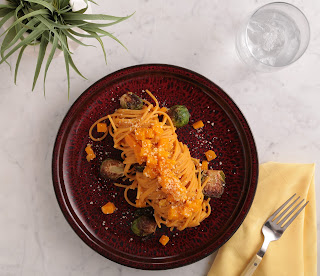
Pasta with Butternut Squash and Brussels Sprouts

My introduction to legume and bean-based pasta was thanks to Barilla. I was lucky because I got to attend a webinar with Barilla's incredible chef, Lorenzo Boni. I tried his recipe for pasta with butternut squash and Brussels sprouts which I definitely recommend and have now made several times. If you've seen his wildly popular (150k+ followers!) Instagram feed you know he's a master at making all kinds of pasta dishes and that he often eats plant-based meals. I followed up with him to get some tips on cooking with pasta made from beans and legumes.

Pasta made with beans and legumes is higher in protein and so the recommended 2-ounce portion is surprisingly filling. But the texture isn't always the same as traditional semolina or durum wheat pasta. Chef Boni told me, "The nature of legume pasta makes it soak up more moisture than traditional semolina pasta, so you always want to reserve a bit of cooking water to adjust if needed." But when it comes to cooking, he says that with Barilla legume pasta you cook it the same way as semolina pasta. "Boil in salted water for the duration noted on the box and you'll have perfectly al dente pasta." They are all gluten-free.

Chickpea pasta

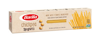
When I asked Chef Boni about pairing chickpea pastas with sauce he said, "Generally speaking, I prefer olive oil based sauces rich with vegetables, aromatic herbs and spices. Seafood also pairs well with chickpea options. If used with creamy or tomato-based sauces, keep in mind to always have some pasta water handy to adjust the dish in case it gets too dry." He added, "One of my favorite ways to prepare a legume pasta dish would be a simple chickpea rotini with shrimp, diced zucchini and fresh basil. The sauce is light enough to highlight the flavor of the pasta itself, while the natural sweetness helps keep the overall flavor profile more appealing to everyone." I like the Barilla brand because the only ingredient is chickpeas. Banza makes a popular line of chickpea pasta as well although they include pea starch, tapioca and xanthan gum.

Edamame pasta


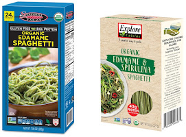
I tried two different brands of edamame pasta, Seapoint Farms and Explore Cuisine. The Seapoint pasta has a rougher texture than the Explore. With the Seapoint I found the best pairings were earthy chunky toppings like toasted walnuts and sautéed mushrooms. The Explore Cuisine edamame & spirulina pasta is smoother and more delicate, and worked well with an Asian style peanut sauce. I was happy with the Seapoint brand, but would definitely choose the Explore brand instead if it's available.


Red lentil pasta

Red lentil pasta is most similar to semolina pasta. Barilla makes red lentil pasta in a variety of shapes. But for spaghetti, Chef Boni says, "Barilla red lentil spaghetti is pretty flexible and works well with pretty much everything. I love red lentil spaghetti with light olive oil based sauces with aromatic herbs and some small diced vegetables. It also works well with a lean meat protein." I have to admit, I have yet to try red lentil pasta, but I'm excited to try it after hearing how similar it is to semolina pasta. It is made only with red lentil flour, that's it. It's available in spaghetti, penne and rotini.

Penne for Your Thoughts

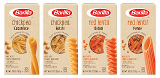
Do you remember seeing photos from Italian supermarkets where the shelves with pasta were barren except for penne? I too seem to end up with boxes of penne or rotini and not a clue what to do with them so I asked Chef Boni his thoughts on the subject. He told me, "Shortcuts such as rotini and penne pair very well with all kind of ragouts as well as tomato based and chunky vegetarian sauces. One of my favorite ways to prepare a legume pasta dish would be a simple chickpea rotini with shrimp, diced zucchini and fresh basil. The sauce is light enough to highlight the flavor of the pasta itself, while the natural sweetness helps keep the overall flavor profile more appealing to everyone." Thanks chef! When zucchini is in season I know what I will try!

15 Feb 2022 6:46pm GMT

23 Nov 2021

feedCooking with Amy: A Food Blog

A Conversation with Julia Filmmakers, Julie Cohen and Betsy West


Julia is a new film based on Dearie: The Remarkable Life of Julia Child by Bob Spitz and inspired by My Life in France by Julia Child with Alex Prud'homme and The French Chef in America: Julia Child's Second Act by Alex Prud'homme. Julia Child died in 2004, and yet our appetite for all things Julia hasn't waned.

I grew up watching Julia Child on TV and learning to cook the French classics from her books, And while I never trained to be a chef, like Child I also transitioned into a career focused on food, a subject I have always found endlessly fascinating. I enjoyed the new film very much and while it didn't break much new ground, it did add a layer of perspective that can only come with time. In particular, how Julia Child became a ubiquitous pop culture figure is addressed in a fresh way.


I reached out to the filmmakers,Julie Cohen and Betsy West to find out more about what inspired them and why Julia Child still holds our attention.


Julia Child died over 15 years ago and has been off TV for decades. Why do you believe we continue to be so fascinated by her?

In some ways Julia is the Godmother of modern American cooking - and eating. Her spirit looms over cooking segments on the morning shows, The Food Network, and all those overhead Instagram shots the current generation loves to take of restaurant meals. Beyond that, though, Julia's bigger than life personality and unstoppable joie de vivre are infectious. People couldn't get enough of her while she was living, and they still can't now.

There have been so many Julia Child films and documentaries, what inspired this one?

Well there'd been some great programs about Julia but this is the first feature length theatrical doc. Like everyone else, we adored Julie & Julia, but a documentary gives you a special opportunity to tell a person's story in their own words and with the authentic images. This is particularly true of Julia, who was truly one of a kind.

The impact of Julia Child how she was a groundbreaker really comes across in the film, are we understanding her in a different light as time passes?

People understand that Julia was a talented television entertainer, but outside the professional food world, there's been an under-recognition of just how much she changed the 20th century food landscape. As Jose Andres points out in the film, almost every serious food professional has a sauce-splashed copy of "Mastering the Art of French Cooking" on their shelves. We also felt Julia's role in opening up new possibilities for women on television deserved more exploration. In the early 1960's the idea of a woman on TV who was neither a housewife nor a sex bomb but a mature, tall, confident expert was downright radical. She paved the way for many women who followed.

The food shots add an extra element to the film and entice viewers in a very visceral way, how did those interstitials come to be part of the film?

We knew from the start that we wanted to make food a major part of this story, not an afterthought. We worked with cook and food stylist Susan Spungen to determine which authentic Julia recipes could be integrated with which story beats to become part of the film's aesthetic and its plot. For instance the sole meunière is a key part of the story because it sparked her obsession with French food, and the pear and almond tart provides an enticing metaphor for the sensual side of Julia and Paul's early married years.

Note: Susan Spungen was also the food stylist for Julie & Julia

Julia is in theaters now.

23 Nov 2021 11:30pm GMT

05 Oct 2021

feedCooking with Amy: A Food Blog

Meet my Friend & Mentor: Rick Rodgers of the Online Cooking School Coffee & Cake


Rick Rodgers

I met Rick Rodgers early in my career as a recipe developer and food writer when we were both contributors to the Epicurious blog. Not only is he a lot of fun to hang out with, but he has also been incredibly helpful to me and is usually the first person I call when I'm floundering with a project, client, or cooking quandary. His interpersonal skills, business experience, and cooking acumen explain why he's been recognized as one of the top cooking instructors in America. Literally.


You built a career as a cooking instructor and cookbook author. How many cookbooks have you written?

I was asked recently to make an official count, and It looks like an even hundred. Many of those were collaborations with chefs, restaurants, celebrities, bakeries, and business entities, such as Tommy Bahama, Williams-Sonoma, and Nordstrom. I made it known that I was available for collaboration work, and my phone literally rang off the hook for quite a few years with editors and agents looking for help with novice writers or those that wanted a branded book.


Which cookbook(s) are you most proud of?

There are three books that I get fan mail for almost every day: Kaffeehaus (where I explore the desserts of my Austrian heritage), Thanksgiving 101 (a deep dive into America's most food-centric holiday and how to pull it off), and Ready and Waiting (which was one of the first books to take a "gourmet" approach to the slow cooker). These books have been in print for 20 years or more, which is a beautiful testament to their usefulness to home cooks.


How did you get started as a cooking instructor and what are some highlights of your teaching career?

I was a theater major at San Francisco State College (now University), so getting in front of a crowd held no terrors for me. When more brick-and-mortar cooking schools opened in the eighties, I was ready for prime time. During that period, there were at least twelve cooking schools in the Bay Area, so I made quarterly trips here a year from the east coast, where I had moved. My Thanksgiving classes were so popular that I taught every day from November 1 to Thanksgiving, with a couple of days off for laundry and travel. The absolute pinnacle of my teaching career was being named Outstanding Culinary Instructor of The Year by Bon Appétit Magazine's Food and Entertaining Awards, an honor that I share with only a handful of other recipients, including Rick Bayless and Bobby Flay.

Flódni
Flódni


How have cooking classes changed since you started?

Because there are so many classes available, I can teach at any level of experience. At the cooking schools, we tended to walk a fine line between too difficult and too easy. The exposure to different cuisines and skill levels on TV also has seriously raised the bar. Unfortunately, students want to walk before they can run. They want to learn how to make croissants when I doubt that they can bake a pound cake correctly. It is best to build on your skills instead of going right to the top. That being said, in my online classes, I am concentrating on the more challenging recipes because that is what the market demands of me.


Tell me about your baking school, coffeeandcake.org

As much as I loved my cookbooks and in-person classes, I knew there was a more modern way to reach people who wanted to cook with me, especially since so many cooking schools had closed. I retired the day I got my first Social Security check. But…as I was warned by my friends who knew me better than I did…I was bored, and wanted a new project. I heard about online classes through other teachers who were having success. I found an online course specifically for cooking classes (Cooking Class Business School at HiddenRhythm.com), got the nuts and bolts down, and I finally entered the 21st century!


How do you decide which recipes to teach?

I felt there were plenty of other places to learn how to make chocolate chip cookies and banana bread-just take a look on YouTube alone. I had a specialty of Austro-Hungarian baking thanks to my Kaffeehaus book, so I decided to niche into that category. I have branched out to a few other locations, but my goal is to expose students to something new and out of the ordinary. I also survey my students on what they would like me to teach, and those answers are amazing. People are truly interested in the more difficult desserts. Perhaps it is because so many people discovered baking as a hobby during the pandemic?


For students who have your cookbooks, what are the advantages of taking an online class?

There is no substitute for seeing a cook in action. Plus you get to answer questions during class. In a recent class, I made six-layer Dobos Torte in two hours' real-time to prove that you can do it without giving up a week of your life. And we don't have to travel to each other to be "together." My classes are videotaped so you can watch them at your convenience.


What are some highlights of your upcoming schedule of classes?

Honey cake
Honey cake

In October, I am teaching virtually all Hungarian desserts, things that will be new to most people. I am making one of my absolute favorites, Flódni, which is a Jewish bar cookie (almost a cake) with layers of apple, poppy seeds, and walnuts between thin sheets of wine-flavored cookie dough. San Franciscans in particular will be happy to see a master class that I am teaching with the delightful Michelle Polzine, owner of the late and lamented 20th Century Cafe and author of Baking at the 20th Century Cafe. We will be making her (in)famous 12-layer honey cake on two coasts, with me doing the heavy lifting in New Jersey and Michelle guiding me from the west coast. That is going to be fun! In November and December, I am switching over to holiday baking and a few savory recipes for Thanksgiving, including my fail-proof turkey and gravy, which I have made over 300 times in classes over 30 years' worth of teaching. It ought to be perfect by now


Head to Coffee and Cake to sign up for classes or learn more.


05 Oct 2021 3:56pm GMT

03 Dec 2014

feedVincent Caut


!!!


Changement d'adresse !

Maintenant, ça se passe ICI


!!!

03 Dec 2014 8:12pm GMT

16 Jul 2014

feedVincent Caut

16 juillet 2014

16 Jul 2014 6:08pm GMT

14 Jul 2014

feedVincent Caut

14 juillet 2014

Après presque un mois et demi d'absence, deux bouclages d'albums et plein de projets, je trouve enfin le
temps de poster quelque chose sur ce blog ! Ces jours-ci, je vais avoir pas mal de choses à vous montrer !
On commence tranquille avec un petit dessin aux couleurs estivales.

14 Jul 2014 4:25pm GMT