25 Jul 2026
 TalkAndroid
This One Rule from the Creator Changed Everything for the One Piece Live-Action Series
When Netflix set out to bring Luffy and his crew to life, the company had to agree to…
25 Jul 2026 6:30am GMT
I wanted to burn every copy”: How Stallone almost destroyed Rambo after a disastrous first edit
Before it became an icon of action cinema, "Rambo" nearly suffered a fatal setback. Sylvester Stallone has revealed…
25 Jul 2026 6:00am GMT
How to Choose the Right Galaxy Z Fold8/Ultra Case?Benks ArmorGrid Air vs. Pro
Samsung's Galaxy Z Fold8/Ultra brings foldable smartphones closer to everyday use with a larger flexible display, improved multitasking…
25 Jul 2026 5:13am GMT
22 Jul 2026
Android Developers Blog
Optimize your apps for the next generation of Samsung Galaxy devices
.png)

Today at Galaxy Unpacked, Samsung unveiled its latest lineup of foldable and wearable devices. For developers, this means that the variety of form factors, screen sizes, and device postures your app needs to support is expanding once again.
With devices like the Galaxy Z Fold8, the ecosystem is expanding to include hardware with a landscape-first natural orientation and a wider aspect ratio in its main display state. Whether a user is unfolding a large display, flipping open a cover screen, or glancing at their wrist, users expect a flawless experience. To help you meet this moment, we're sharing actionable guidance and new tooling updates to enable you to build adaptively proactively.
Rethink layout architecture for dynamic displays, including ultra-wide foldables
Building for the latest foldables means dropping assumptions about display orientation and size. This is especially true for the Galaxy Z Fold8, which adopts an ultra-wide display, adding to the variety of aspect ratios to account for. Devices with this landscape-first natural orientation show the limitations of hardcoded layout rules when users unfold the device. That's why we've introduced dedicated guidance for building for landscape foldables and trifolds.

To build a responsive UI that handles these physics seamlessly, focus on the following core pillars:
- Build fluid, adaptive layouts: Wide aspect ratios and compact vertical heights require fluid UIs that scale responsively. Our updated adaptive design guidance advises considering the window class width first to determine layout changes, then adjusting for height. To let individual components fluidly adapt to the grid, structure your layout using flexible containers that allow your content to automatically wrap, span, and reflow. For design inspiration browse our adaptive sample app and dual-screen design galleries.
- Track actual app space: Your app's display space rarely matches the physical device size, especially on an ultra-wide screen during multi-window, split-screen, or multitasking states. Sometimes even the orientations differ. Leverage Window Size Classes using the Jetpack Window Manager library to calculate the exact space your app occupies.
- Leverage the latest Jetpack Compose Update: Start by adopting the stable Jetpack Compose April '26 release (Compose BOM version
2026.04.01).Take advantage of the new structural layout tools to manage complex architectures. The new Grid API allows you to define dynamic tracks and column spans without the performance overhead of a lazy list. Pair Grid with the new FlexBox layout API to easily handle multi-axis alignment and dynamic item wrapping. You can also use the new MediaQuery API to adapt your UI to its environment, using conditions to detect signals like device posture, window size, and keyboard types. - Make your app fold aware: Use the Jetpack WindowManager library, which provides an API surface for foldable device window features such as folds and hinges. When your app is fold aware, it can adapt its layout to avoid placing important content in the area of folds or hinges and use folds and hinges as natural separators.
- Maintain app continuity: Avoid breaking the user journey when the device configuration shifts. Retain your UI state using ViewModel to ensure smooth transitions when a user folds or unfolds their device.

Ensure seamless camera capture on foldable devices
Extend glanceable interactions to Wear OS 7
Build intelligent features
Start optimizing today
22 Jul 2026 7:00pm GMT
21 Jul 2026
Android Developers Blog
Build intelligent Android apps: On-device inference


Welcome back to the blog post series "Build intelligent Android apps" where we take a basic Android app and transform it into a personalized, intelligent, and agentic experience. In our previous post we introduced Jetpacker, the demo app we'll use throughout this series.
In this blog post, we will share how you can use Gemini Nano through ML Kit's Prompt API to build intelligent on-device features.
Building intelligent on-device features refers to the ability to process prompts and data directly on a device without sending data to a server. This offers a few advantages:
- User data can be processed locally on the device, preserving user privacy
- Functionality of the model is reliable even with spotty or no internet connection
- No additional cloud inference cost, since everything runs on the user's hardware
With the benefits of on-device in mind, we identified three features to add in Jetpacker that can improve the user experience: summarizing trip itineraries, managing expenses, and capturing voice notes.

On-device features in Jetpacker: Summarizing trip itineraries, managing expenses, and voice notes
High quality tailored summarization of short texts
The itinerary screen gives users a quick overview of all activities for a given trip. Since this screen contains a lot of information, it can quickly become overwhelming. To help users prepare without feeling overwhelmed, we can add a 'Get ready for your trip' section at the top.

By inputting a trip itinerary and asking an LLM to summarize it, we can generate a quick summary of the trip along with packing tips and useful local phrases. This is a great use case for an on-device model for several reasons:
- Performance and quality: Both the input and output text are relatively short. With that, we can expect the performance and quality of an on-device solution to be on par with more powerful cloud models.
- Scalability: Shifting inference on-device allows us to scale this feature from a few users to millions without worrying about managing increasing cloud inference costs.
- Low latency and reliability: On-device inference guarantees low latency, providing a reliable experience even when users are offline.
To build with on-device, we use Gemini Nano, Google's most efficient model optimized for mobile devices. Gemini Nano was first introduced a few years ago, and is now running on over 140 million devices. The latest version of the model, Gemini Nano 4, is built on the architecture foundation of the recently released Gemma 4 model, and is further optimized for maximum battery and performance efficiency.
Using ML Kit's Prompt API, we can take advantage of Gemini Nano 4's new model capabilities to prototype our on-device features. We'll create a prompt that includes the itinerary of a trip and ask the model to generate a summary along with any preparation tips.
// implementation("com.google.mlkit:genai-prompt:1.0.0-beta3")

// Define the configuration for Gemini Nano 4 E2B preview model
val previewFastConfig = generationConfig {
    modelConfig = modelConfig {
        releaseStage = ModelReleaseStage.PREVIEW
        preference = ModelPreference.FAST
    }
}

val geminiNano2BPreviewModel = Generation.getClient(previewFastConfig)

val tripItinerary = ...

val getReadyForYourTripSummary = geminiNano2BPreviewModel
 .generateContent("Given this trip itinerary: $tripItinerary,
     generate the following: overall vibe, tips on how to prepare for this
     trip, and common short phrases to learn for the trip.")
Finding the optimal prompt usually requires some iteration, and the AICore app is perfect for this step in the process. After opting into the developer preview option for AICore, we can download preview models such as Gemini Nano 4 to test prompts and see the model's expected outputs. With a few iterations on the prompt, we were able to improve the speed of the response from 13 seconds to under 2 seconds! Check out the final code implementation and prompt here.

Local processing for sensitive user input
Next, to help users enjoy their trip even more, we'll build a simple expense manager that takes the manual work out of sorting through receipts and calculating budgets.
Since receipts might contain sensitive information like credit card number and addresses, this is another great use case for an on-device solution. With on-device, users can be confident that private information will be processed locally on the device without any of their data being sent to the cloud.
In addition, Gemini Nano 4 has improved model capabilities for multimodality, especially for image understanding tasks like OCR and visual data extraction, making it a great solution for tasks like extracting information from receipts.
For this use case, the prompt will analyze an image of the receipt, and output information such as: a generated title, amount spent and category of the expense. To ensure the model outputs the information in the preferred format, we can use ML Kit's Structured Output API to seamlessly output a Kotlin data object that we define.
// implementation("com.google.mlkit:genai-prompt:1.0.0-beta3")
// ksp("com.google.mlkit:genai-schema-compiler:1.0.0-alpha1")

@Generable("Information extracted from an expense receipt")
data class ParsedReceipt(
  @Guide("Generated title for the expense less than 6 words. Based on restaurant or activity name.")
  val title: String,
  @Guide("Total amount of the expense. Look for values at the bottom and words like total or balance due.")
  val amount: Double,
  @Guide("Type of expense", enumValues = ["travel", "food", "shopping", "entertainment", "other"])
  val category: String,
)

val prompt = "Determine if the image is a receipt or expense.
    If it is NOT a receipt or expense, output the text 'NOT_A_RECEIPT'.
    Otherwise, parse the receipt information."

val request = generateContentRequest(ImagePart(bitmap), TextPart(prompt)) {}
val requestWithStructuredOutput = generateTypedContentRequest(request, ParsedReceipt::class)

// Define the configuration for Gemini Nano 4 E4B preview model
// When selecting models, you can specify which performance charactertists are most important
//  for your use case. Use ModelPreference.FULL when you want to prioritize reasoning power over speed.
//  Use ModelPreference.FAST when complex logic is not required and latency is a priority.
val previewFullConfig = generationConfig {
    modelConfig = modelConfig {
        releaseStage = ModelReleaseStage.PREVIEW
        preference = ModelPreference.FULL
    }
}

val geminiNano4BPreviewModel = Generation.getClient(previewFullConfig)
val response = geminiNano4BPreviewModel.generateContent(requestWithStructuredOutput)
val parsedReceipt: ParsedReceipt? = response.candidates.firstOrNull()?.response
Multimodal input
Lastly, to help users record audio memos during the trip, let's build a fully on-device voice notes feature. Using ML Kit's Speech Recognition API, we'll enable users to record short voice notes that are automatically transcribed to text. With the transcribed text, we'll use ML Kit's Prompt API to identify which trip activity is associated with the recorded voice note, letting users easily recap their trip as they scroll through the trip's itinerary.

The Roman holiday itinerary shows voice note extracts.
The ML Kit GenAI Speech Recognition API allows you to transcribe audio content to text fully on-device using two distinct modes. Basic mode uses a traditional on-device speech recognition model and is available on most Android devices with API level 31 and higher. Advanced mode uses Gemini Nano to offer broader language coverage and better quality, and is currently supported on Pixel 10 devices.
For our feature we combine the Speech Recognition API with the ML Kit GenAI Prompt API:
// implementation("com.google.mlkit:genai-prompt:1.0.0-beta3")
// implementation("com.google.mlkit:genai-speech-recognition:1.0.0-alpha1")

val tripEvents = ...

// Set up speech recognition
val speechRecognizerOptions =
    speechRecognizerOptions {
        locale = Locale.US
        preferredMode = SpeechRecognizerOptions.Mode.MODE_ADVANCED
    }
val speechRecognizer: SpeechRecognizer = SpeechRecognition.getClient(speechRecognizerOptions)

suspend fun transcribeVoiceNote(recognizer: SpeechRecognizer) {
    // Display partial text as the user is recording audio
    var partialTextResponse = ""

    // Display the full text once user is finished recording audio
    var transcription = ""

    val request: SpeechRecognizerRequest
        = speechRecognizerRequest { audioSource = AudioSource.fromMic() }
    recognizer.startRecognition(request).collect { response ->
        when (response) {
            is SpeechRecognizerResponse.PartialTextResponse -> {
                partialTextResponse = response.text
            }
            is SpeechRecognizerResponse.FinalTextResponse -> {
                transcription = response.text
                processAndCategorizeVoiceNote(transcription, tripEvents)
            }
        }
    }
}

fun processAndCategorizeVoiceNote(transcribedVoiceNote: String, events: List) {
    val prompt = "Given the voice note $transcribedVoiceNote
     and the following events for this trip: $events, rewrite this transcription
     to remove filler words. Then, identify which events from the
     list this rewritten transcription matches to."

     // Utilize ML Kit's Prompt API to process voice note and tag it with the relevant trip activities
     Generation.getClient().generateContent(prompt)
}
Conclusion
Using ML Kit's GenAI APIs, we were able to take advantage of Gemini Nano to develop fully on-device intelligent features for the JetPacker app, and provide an improved user experience without any additional cloud costs.
Check out the full source code for Jetpacker on Github, and watch the video Build Intelligent Android apps with Google's AI to learn more about how to integrate intelligent features directly into your app using on-device models, cloud-powered reasoning, and the latest agentic frameworks.
Learn more
Check out the other parts of this blog post series:
Part 1: Introduction of the app and a high-level overview.Part 2 (this post!): On-device intelligence. Deep-dive into ML Kit's GenAI APIs and Gemini Nano to build privacy-first features like itinerary summarization, receipt parsing, and local audio processing.
Part 3: Hybrid and cloud reasoning. Explore how to use Firebase AI Logic to ground LLM answers in real-world data like Google Maps and web context.
Part 4: System integration. Integrating with the Android intelligence system using AppFunctions.
Part 5 (coming soon): In-app agentic workflows. Extend the app with an end-to-end booking assistant powered by A2UI and ADK.
Interested in more on Android Development? Follow Android Developers on YouTube or LinkedIn!
All code snippets in this blog post follow the following copyright notice:
Copyright 2026 Google LLC.
SPDX-License-Identifier: Apache-2.0
21 Jul 2026 1:00pm GMT
Build intelligent Android apps: Introduction to Jetpacker


Building GenAI features in your app usually means navigating through various models, APIs and architecture choices:
- Execution location: Where does your model run? On device, in the cloud, or both?
- Complexity: How complex is your setup? Are you doing a single inference call or do you need a more agentic flow?
- In-app or Android System: Should your feature be built into your Android app or does it fit better as an Android system integration?
In this blog post series we'll navigate these choices with you. We will take you along on a journey, starting with a basic mobile app and transforming it into a personalized, intelligent, and agentic experience.
Jetpacker: a demo travel app
Jetpacker is a technical showcase app that our team built from the ground up for this year's Google I/O (built using Antigravity). At its core, Jetpacker helps users plan, explore, and enjoy their next big adventure. It shows an overview of your trips, the itinerary of each trip, and details of each event on that trip. Of course following all best practices of Android development, including a beautifully expressive Material UI design.
And best of all? It's fully open source!
Today we are publishing a series of technical blog posts diving deep into each of these features. We'll provide detailed implementation steps, code snippets, and architectural insights to help you build your own intelligent Android applications.
On-device intelligence

Using an on-device model comes with no additional cloud inference costs, means you don't have to worry about internet connectivity, and lets users be confident that private information will be processed locally, on the device, without any of their data being sent to the cloud.
In Jetpacker, we chose on-device inference for three of our features:
- The trip overview feature transforms a messy, multi-day itinerary into a concise, actionable summary. It leverages Gemini Nano through the ML Kit GenAI APIs to process data locally on the device. We consider this a nice-to-have feature where we don't want to incur extra cloud costs, making on-device inference the right choice.
- The expense tracker automatically extracts structured data from receipt images to help users track their travel spending. It uses the multimodal capabilities of Gemini Nano 4 through the ML Kit GenAI APIs. We choose an on-device solution so that any privacy-sensitive information on the receipt images never leaves the user's device.
- The audio diary records, transcribes, and categorizes voice notes into relevant trip activities. It is powered by the ML Kit Speech Recognition and GenAI Prompt APIs. We chose an on-device solution for privacy and connectivity reasons.
Cloud & hybrid inference

Sometimes your use-case requires AI models with greater world knowledge or a much larger context window and with greater ability in handling complex tasks. In that case, we can switch from running an on-device model to using a cloud model instead.
Or, if you want to get the best of both worlds, you can use hybrid inference to dynamically choose either a cloud or on-device model at runtime. This allows us to lower costs by moving inference to the device when it is available, but at the same time support all Android devices running the app.
In Jetpacker, we implemented several features using cloud or hybrid inference:
- The place Q&A feature answers user questions about specific locations by grounding responses in real-world data. It uses Firebase AI Logic integrated with Google Maps and web context. Using a cloud model is necessary here for its greater world knowledge.
- The review drafting feature helps users compose detailed reviews for the places they have visited. It leverages both on-device and cloud models through Firebase AI Logic's new Hybrid inference API. This is a feature we wanted to make available to all app users, so we're using a cloud model as a fallback when an on-device model is unavailable.
- The automatic chat translation dynamically translates chat messages in real time to facilitate seamless communication, demonstrating custom hybrid inference logic. Again, we want this feature to be available to all app users, but at the same time have some specific considerations on when to choose on-device versus cloud.
System integration
While not a feature you see in the app itself, the Android system integration opens up the app's core capabilities directly to the Android operating system. It uses the AppFunctions API to integrate with system-level intelligence.
In-app agentic workflows (coming soon!)
.png)
Agenticness introduces a higher level of autonomy, enabling models to act as agents. Instead of a single inference call, an agent works towards a specific goal via an orchestration loop that allows it to reason, use tools, and adapt its path. Depending on your requirements, these intelligent agents can run either in the cloud, directly on-device, or in a hybrid setup.
For Jetpacker we added a booking assistant that automates end-to-end booking workflows directly within the application to streamline reservations. It is built using A2UI and ADK running in the cloud. The Android app functions as a front-end to the multi-agentic system running in the cloud.
Learn more
Check out the other parts of this blog post series:
Part 1 (this post!): Introduction of the app and a high-level overview.Part 2: On-device intelligence. Deep-dive into ML Kit's GenAI APIs and Gemini Nano to build privacy-first features like itinerary summarization, receipt parsing, and local audio processing.
Part 3: Hybrid and cloud reasoning. Explore how to use Firebase AI Logic to ground LLM answers in real-world data like Google Maps and web context.
Part 4: System integration. Integrating with the Android intelligence system using AppFunctions.
Part 5 (coming soon): In-app agentic workflows. Extend the app with an end-to-end booking assistant powered by A2UI and ADK.
Interested in more on Android Development? Follow Android Developers on YouTube or LinkedIn!
21 Jul 2026 1:00pm GMT
26 Jan 2026
Planet Maemo
Igalia Multimedia contributions in 2025
Now that 2025 is over, it's time to look back and feel proud of the path we've walked. Last year has been really exciting in terms of contributions to GStreamer and WebKit for the Igalia Multimedia team.
With more than 459 contributions along the year, we've been one of the top contributors to the GStreamer project, in areas like Vulkan Video, GstValidate, VA, GStreamer Editing Services, WebRTC or H.266 support.
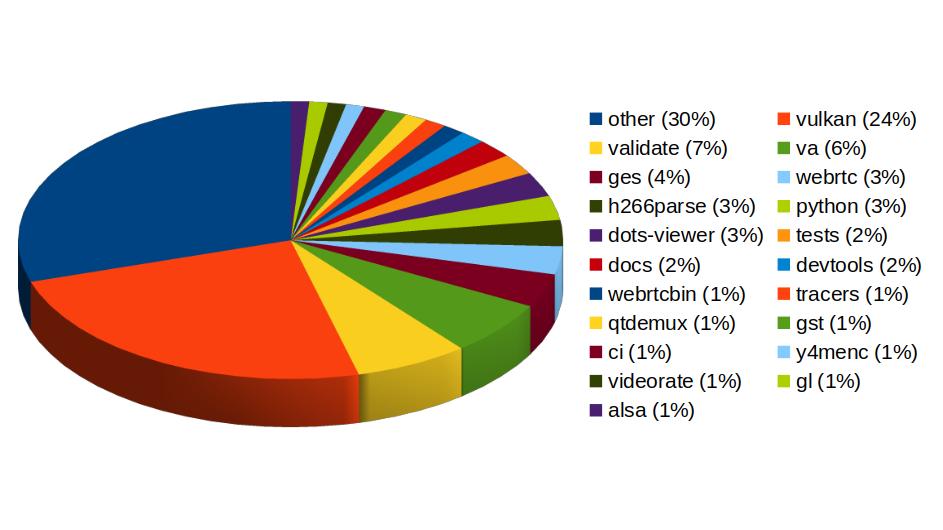
In Vulkan Video we've worked on the VP9 video decoder, and cooperated with other contributors to push the AV1 decoder as well. There's now an H.264 base class for video encoding that is designed to support general hardware-accelerated processing.
GStreaming Editing Services, the framework to build video editing applications, has gained time remapping support, which now allows to include fast/slow motion effects in the videos. Video transformations (scaling, cropping, rounded corners, etc) are now hardware-accelerated thanks to the addition of new Skia-based GStreamer elements and integration with OpenGL. Buffer pool tuning and pipeline improvements have helped to optimize memory usage and performance, enabling the edition of 4K video at 60 frames per second. Much of this work to improve and ensure quality in GStreamer Editing Services has also brought improvements in the GstValidate testing framework, which will be useful for other parts of GStreamer.
Regarding H.266 (VVC), full playback support (with decoders such as vvdec and avdec_h266, demuxers and muxers for Matroska, MP4 and TS, and parsers for the vvc1 and vvi1 formats) is now available in GStreamer 1.26 thanks to Igalia's work. This allows user applications such as the WebKitGTK web browser to leverage the hardware accelerated decoding provided by VAAPI to play H.266 video using GStreamer.
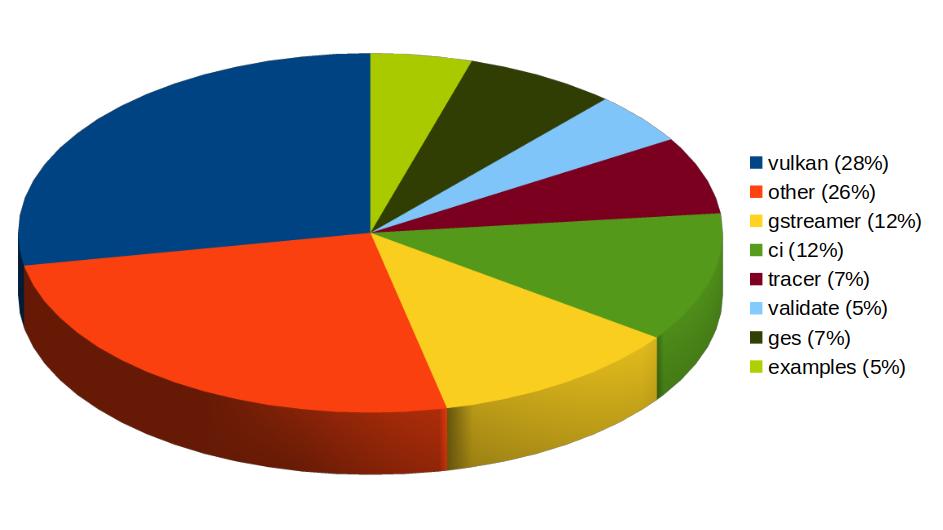
Igalia has also been one of the top contributors to GStreamer Rust, with 43 contributions. Most of the commits there have been related to Vulkan Video.
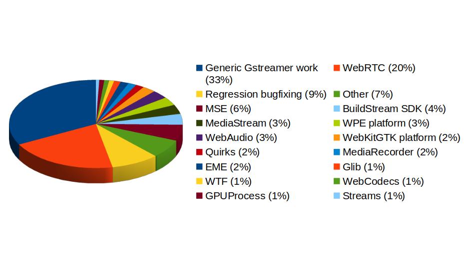
In addition to GStreamer, the team also has a strong presence in WebKit, where we leverage our GStreamer knowledge to implement many features of the web engine related to multimedia. From the 1739 contributions to the WebKit project done last year by Igalia, the Multimedia team has made 323 of them. Nearly one third of those have been related to generic multimedia playback, and the rest have been on areas such as WebRTC, MediaStream, MSE, WebAudio, a new Quirks system to provide adaptations for specific hardware multimedia platforms at runtime, WebCodecs or MediaRecorder.
We're happy about what we've achieved along the year and look forward to maintaining this success and bringing even more exciting features and contributions in 2026.
0  0
0 
26 Jan 2026 9:34am GMT
05 Dec 2025
Planet Maemo
Meow: Process log text files as if you could make cat speak
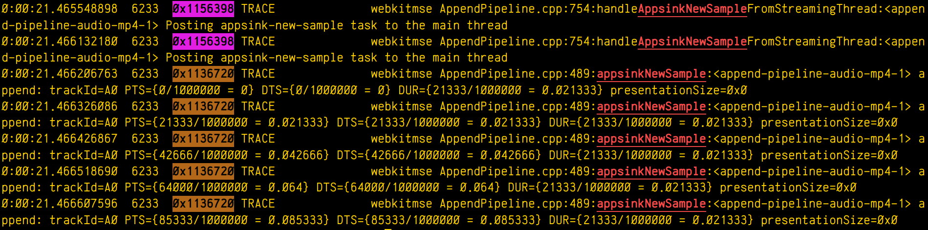
Some years ago I had mentioned some command line tools I used to analyze and find useful information on GStreamer logs. I've been using them consistently along all these years, but some weeks ago I thought about unifying them in a single tool that could provide more flexibility in the mid term, and also as an excuse to unrust my Rust knowledge a bit. That's how I wrote Meow, a tool to make cat speak (that is, to provide meaningful information).
The idea is that you can cat a file through meow and apply the filters, like this:
cat /tmp/log.txt | meow appsinknewsample n:V0 n:video ht: \

ft:-0:00:21.466607596 's:#([A-za-z][A-Za-z]*/)*#'
which means "select those lines that contain appsinknewsample (with case insensitive matching), but don't contain V0 nor video (that is, by exclusion, only that contain audio, probably because we've analyzed both and realized that we should focus on audio for our specific problem), highlight the different thread ids, only show those lines with timestamp lower than 21.46 sec, and change strings like Source/WebCore/platform/graphics/gstreamer/mse/AppendPipeline.cpp to become just AppendPipeline.cpp", to get an output as shown in this terminal screenshot:
Cool, isn't it? After all, I'm convinced that the answer to any GStreamer bug is always hidden in the logs (or will be, as soon as I add "just a couple of log lines more, bro"  0 0
0 0
05 Dec 2025 11:16am GMT
15 Oct 2025
Planet Maemo
Dzzee 1.9.0 for N800/N810/N900/N9/Leste


1 0
15 Oct 2025 11:31am GMT
18 Sep 2022
Planet Openmoko
Harald "LaF0rge" Welte: Deployment of future community TDMoIP hub
I've mentioned some of my various retronetworking projects in some past blog posts. One of those projects is Osmocom Community TDM over IP (OCTOI). During the past 5 or so months, we have been using a number of GPS-synchronized open source icE1usb interconnected by a new, efficient but strill transparent TDMoIP protocol in order to run a distributed TDM/PDH network. This network is currently only used to provide ISDN services to retronetworking enthusiasts, but other uses like frame relay have also been validated.
So far, the central hub of this OCTOI network has been operating in the basement of my home, behind a consumer-grade DOCSIS cable modem connection. Given that TDMoIP is relatively sensitive to packet loss, this has been sub-optimal.
Luckily some of my old friends at noris.net have agreed to host a new OCTOI hub free of charge in one of their ultra-reliable co-location data centres. I'm already hosting some other machines there for 20+ years, and noris.net is a good fit given that they were - in their early days as an ISP - the driving force in the early 90s behind one of the Linux kernel ISDN stracks called u-isdn. So after many decades, ISDN returns to them in a very different way.
Side note: In case you're curious, a reconstructed partial release history of the u-isdn code can be found on gitea.osmocom.org
But I digress. So today, there was the installation of this new OCTOI hub setup. It has been prepared for several weeks in advance, and the hub contains two circuit boards designed entirely only for this use case. The most difficult challenge was the fact that this data centre has no existing GPS RF distribution, and the roof is ~ 100m of CAT5 cable (no fiber!) away from the roof. So we faced the challenge of passing the 1PPS (1 pulse per second) signal reliably through several steps of lightning/over-voltage protection into the icE1usb whose internal GPS-DO serves as a grandmaster clock for the TDM network.
The equipment deployed in this installation currently contains:
-
a rather beefy Supermicro 2U server with EPYC 7113P CPU and 4x PCIe, two of which are populated with Digium TE820 cards resulting in a total of 16 E1 ports
-
an icE1usb with RS422 interface board connected via 100m RS422 to an Ericsson GPS03 receiver. There's two layers of of over-voltage protection on the RS422 (each with gas discharge tubes and TVS) and two stages of over-voltage protection in the coaxial cable between antenna and GPS receiver.
-
a Livingston Portmaster3 RAS server
-
a Cisco AS5400 RAS server
For more details, see this wiki page and this ticket
Now that the physical deployment has been made, the next steps will be to migrate all the TDMoIP links from the existing user base over to the new hub. We hope the reliability and performance will be much better than behind DOCSIS.
In any case, this new setup for sure has a lot of capacity to connect many more more users to this network. At this point we can still only offer E1 PRI interfaces. I expect that at some point during the coming winter the project for remote TDMoIP BRI (S/T, S0-Bus) connectivity will become available.
Acknowledgements
I'd like to thank anyone helping this effort, specifically * Sylvain "tnt" Munaut for his work on the RS422 interface board (+ gateware/firmware) * noris.net for sponsoring the co-location * sysmocom for sponsoring the EPYC server hardware
18 Sep 2022 10:00pm GMT
08 Sep 2022
Planet Openmoko
Harald "LaF0rge" Welte: Progress on the ITU-T V5 access network front
Almost one year after my post regarding first steps towards a V5 implementation, some friends and I were finally able to visit Wobcom, a small German city carrier and pick up a lot of decommissioned POTS/ISDN/PDH/SDH equipment, primarily V5 access networks.
This means that a number of retronetworking enthusiasts now have a chance to play with Siemens Fastlink, Nokia EKSOS and DeTeWe ALIAN access networks/multiplexers.
My primary interest is in Nokia EKSOS, which looks like an rather easy, low-complexity target. As one of the first steps, I took PCB photographs of the various modules/cards in the shelf, take note of the main chip designations and started to search for the related data sheets.
The results can be found in the Osmocom retronetworking wiki, with https://osmocom.org/projects/retronetworking/wiki/Nokia_EKSOS being the main entry page, and sub-pages about
In short: Unsurprisingly, a lot of Infineon analog and digital ICs for the POTS and ISDN ports, as well as a number of Motorola M68k based QUICC32 microprocessors and several unknown ASICs.
So with V5 hardware at my disposal, I've slowly re-started my efforts to implement the LE (local exchange) side of the V5 protocol stack, with the goal of eventually being able to interface those V5 AN with the Osmocom Community TDM over IP network. Once that is in place, we should also be able to offer real ISDN Uk0 (BRI) and POTS lines at retrocomputing events or hacker camps in the coming years.
08 Sep 2022 10:00pm GMT
Harald "LaF0rge" Welte: Clock sync trouble with Digium cards and timing cables
If you have ever worked with Digium (now part of Sangoma) digital telephony interface cards such as the TE110/410/420/820 (single to octal E1/T1/J1 PRI cards), you will probably have seen that they always have a timing connector, where the timing information can be passed from one card to another.
In PDH/ISDN (or even SDH) networks, it is very important to have a synchronized clock across the network. If the clocks are drifting, there will be underruns or overruns, with associated phase jumps that are particularly dangerous when analog modem calls are transported.
In traditional ISDN use cases, the clock is always provided by the network operator, and any customer/user side equipment is expected to synchronize to that clock.
So this Digium timing cable is needed in applications where you have more PRI lines than possible with one card, but only a subset of your lines (spans) are connected to the public operator. The timing cable should make sure that the clock received on one port from the public operator should be used as transmit bit-clock on all of the other ports, no matter on which card.
Unfortunately this decades-old Digium timing cable approach seems to suffer from some problems.
bursty bit clock changes until link is up
The first problem is that downstream port transmit bit clock was jumping around in bursts every two or so seconds. You can see an oscillogram of the E1 master signal (yellow) received by one TE820 card and the transmit of the slave ports on the other card at https://people.osmocom.org/laforge/photos/te820_timingcable_problem.mp4
As you can see, for some seconds the two clocks seem to be in perfect lock/sync, but in between there are periods of immense clock drift.
What I'd have expected is the behavior that can be seen at https://people.osmocom.org/laforge/photos/te820_notimingcable_loopback.mp4 - which shows a similar setup but without the use of a timing cable: Both the master clock input and the clock output were connected on the same TE820 card.
As I found out much later, this problem only occurs until any of the downstream/slave ports is fully OK/GREEN.
This is surprising, as any other E1 equipment I've seen always transmits at a constant bit clock irrespective whether there's any signal in the opposite direction, and irrespective of whether any other ports are up/aligned or not.
But ok, once you adjust your expectations to this Digium peculiarity, you can actually proceed.
clock drift between master and slave cards
Once any of the spans of a slave card on the timing bus are fully aligned, the transmit bit clocks of all of its ports appear to be in sync/lock - yay - but unfortunately only at the very first glance.
When looking at it for more than a few seconds, one can see a slow, continuous drift of the slave bit clocks compared to the master :(
Some initial measurements show that the clock of the slave card of the timing cable is drifting at about 12.5 ppb (parts per billion) when compared against the master clock reference.
This is rather disappointing, given that the whole point of a timing cable is to ensure you have one reference clock with all signals locked to it.
The work-around
If you are willing to sacrifice one port (span) of each card, you can work around that slow-clock-drift issue by connecting an external loopback cable. So the master card is configured to use the clock provided by the upstream provider. Its other ports (spans) will transmit at the exact recovered clock rate with no drift. You can use any of those ports to provide the clock reference to a port on the slave card using an external loopback cable.
In this setup, your slave card[s] will have perfect bit clock sync/lock.
Its just rather sad that you need to sacrifice ports just for achieving proper clock sync - something that the timing connectors and cables claim to do, but in reality don't achieve, at least not in my setup with the most modern and high-end octal-port PCIe cards (TE820).
08 Sep 2022 10:00pm GMT